The power of together
Hikaze. Footwear designed for shared momentum.
My role: Ideation Creative, Art Direction, Concept Design, Brand Design, AI photo generation, Edition.
Challenge: Create a distinctive brand world for a new footwear company inspired by Japanese culture. The identity needed to stand apart from performance sportswear by giving people a deeper emotional reason to choose the brand.
Idea: Instead of celebrating individual achievement, Hikaze celebrates the energy created when people move together.
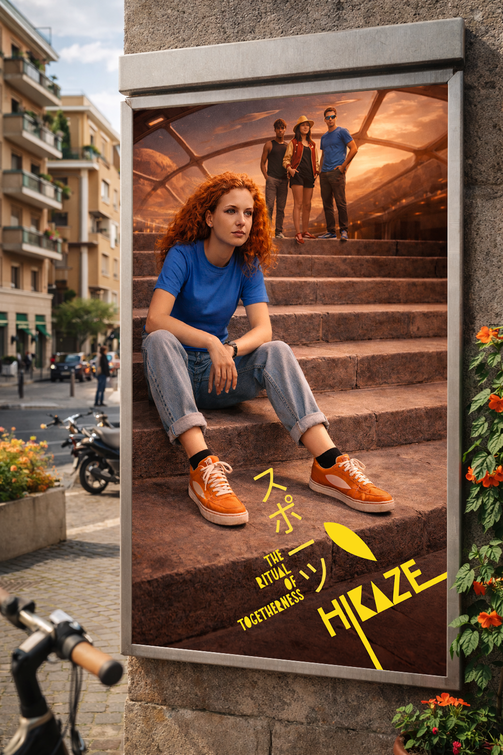
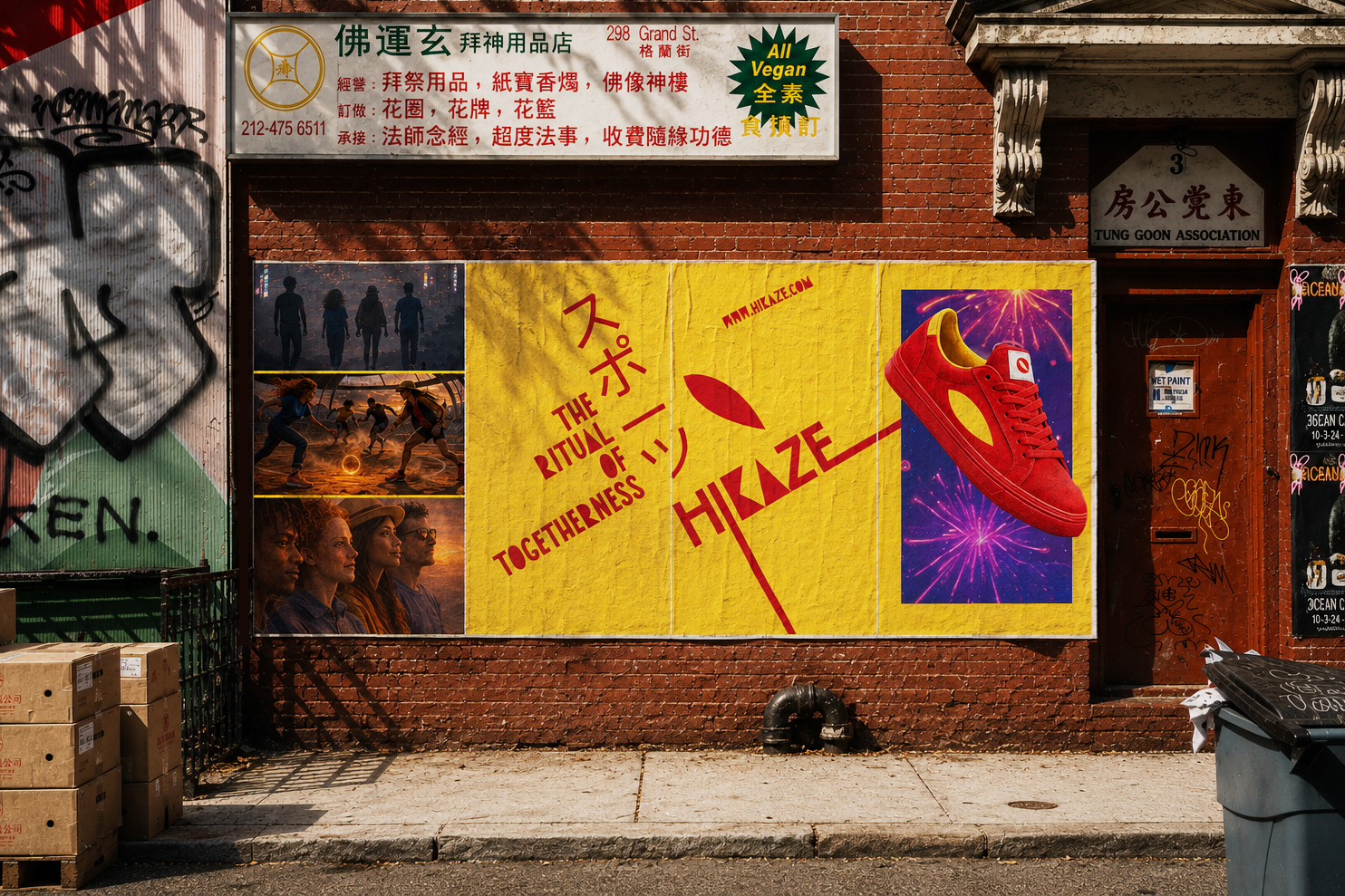
Inspired by Japanese rituals, repetition and collective practices, The Ritual of Togetherness transforms every brand interaction, from retail to social and experiential, into moments that reinforce belonging. Belonging isn't about standing out. It's about moving in sync.
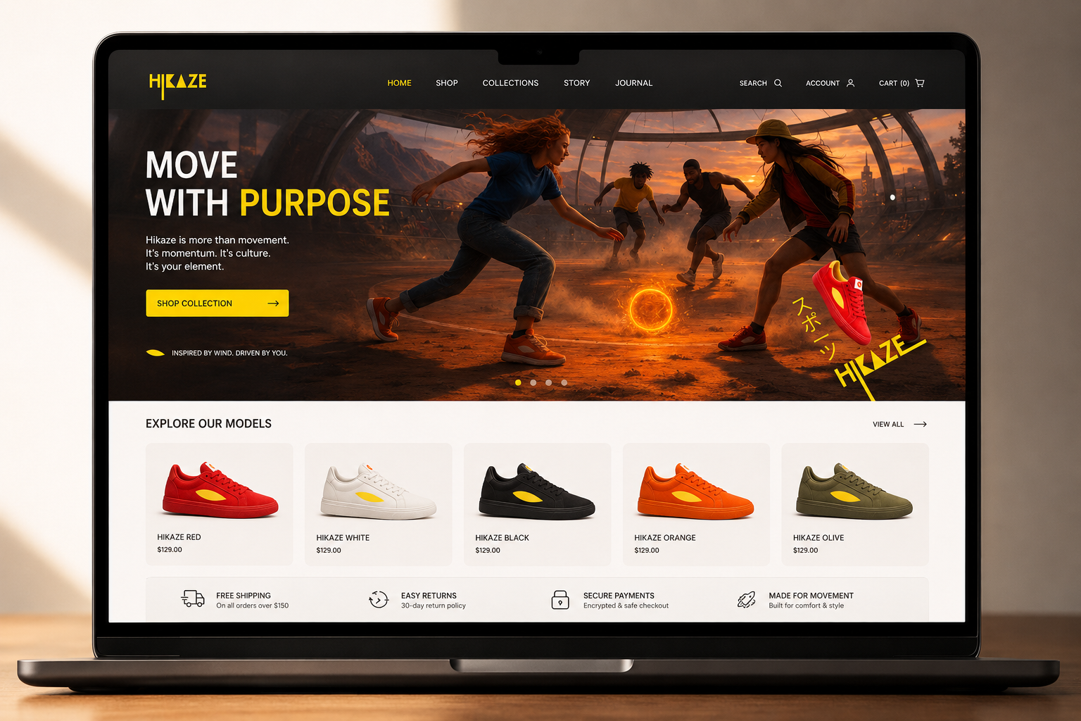
Outcome: A complete creative territory built around a single-minded proposition that extends consistently across identity, campaign, retail, OOH, social content and digital experiences.
The system establishes Hikaze as a brand where movement becomes connection, and every touchpoint reinforces the same emotional idea.
Creative agency: Independent project.
OOH (Posters):
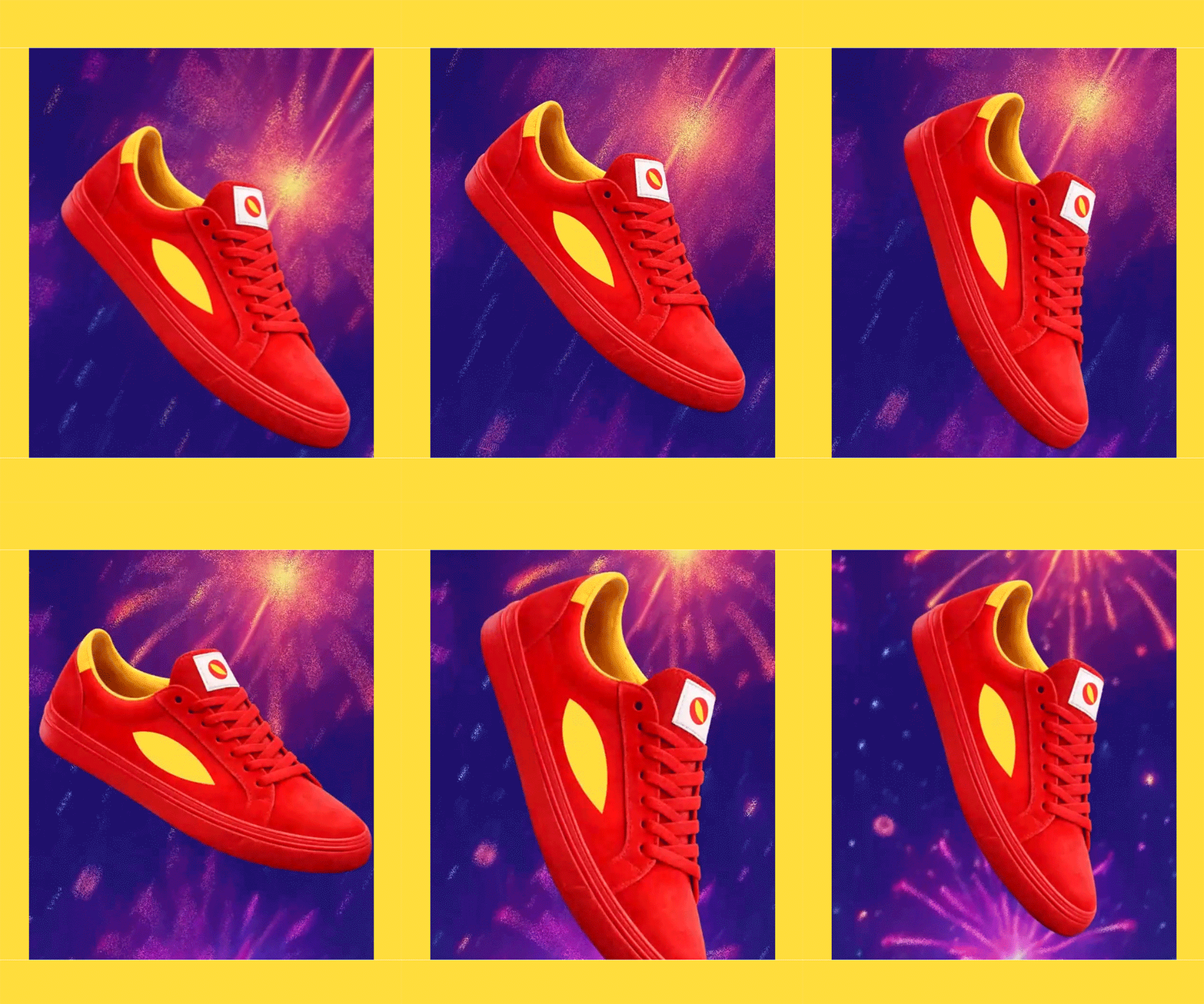
Digital OOH:
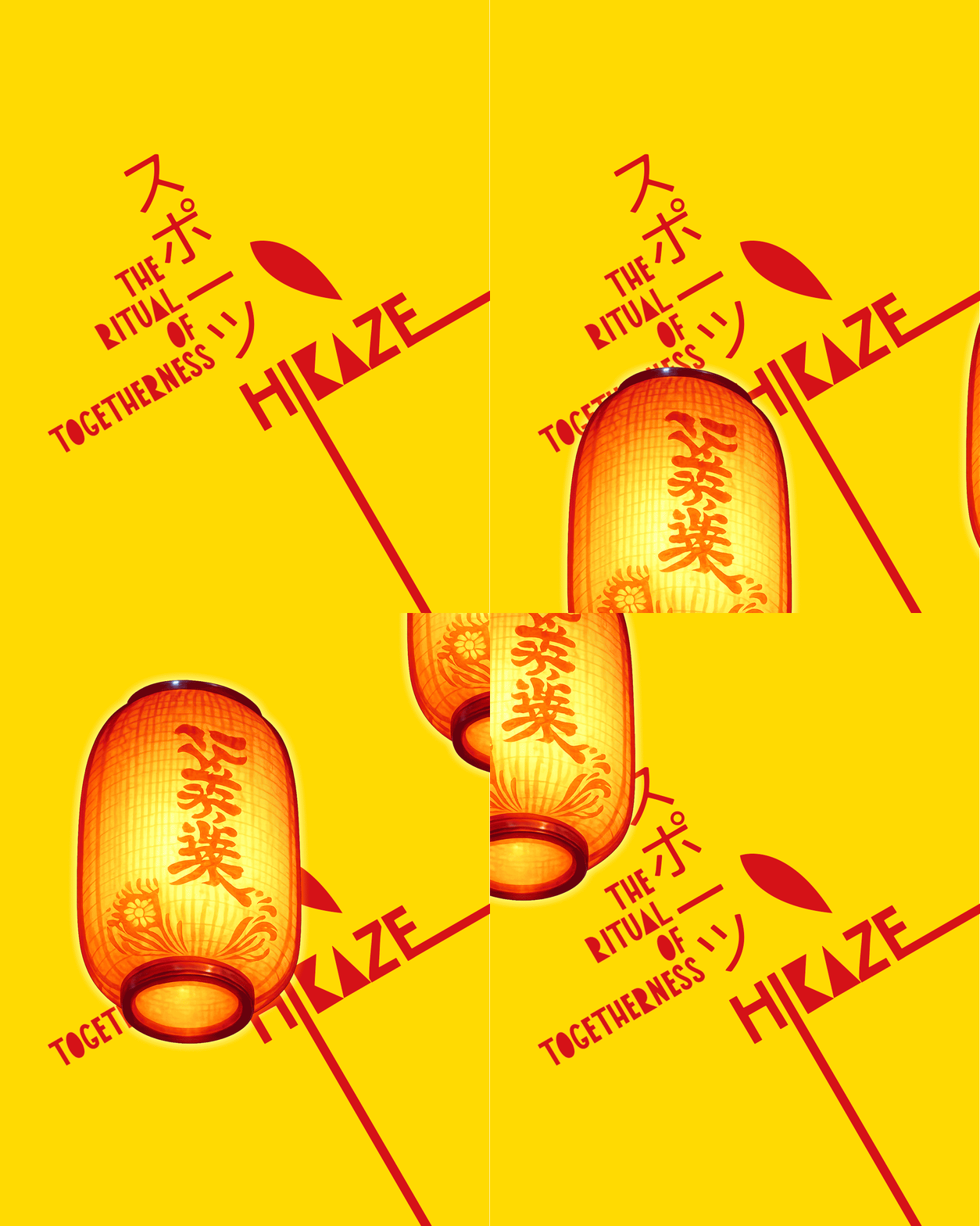
Key visuals:
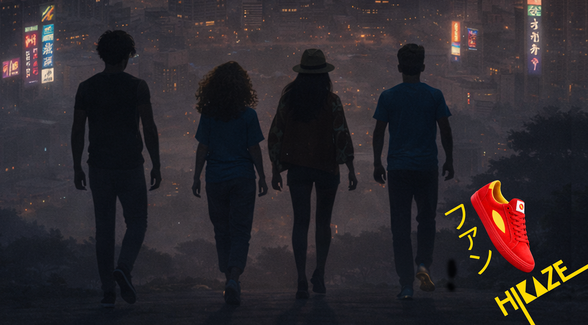
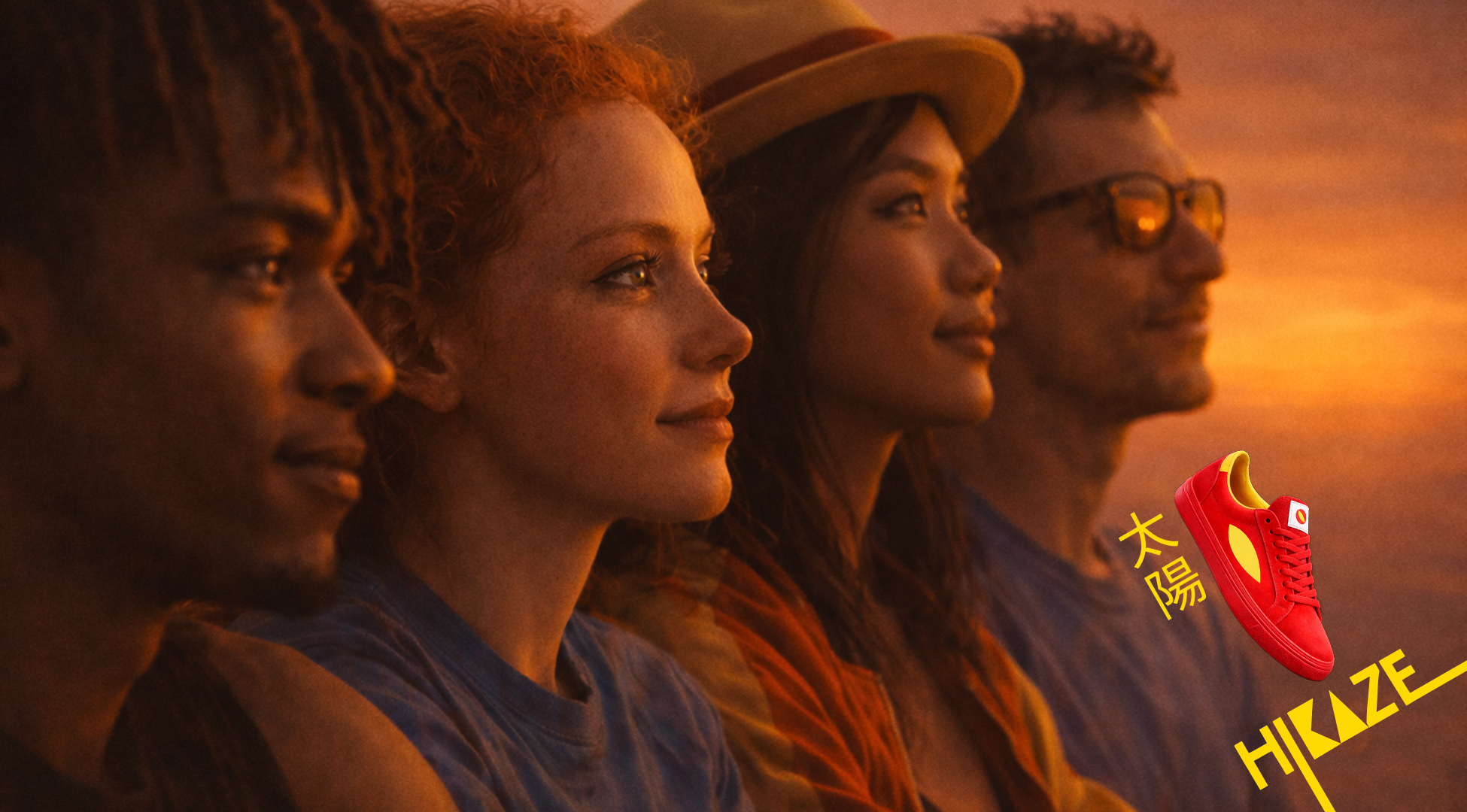
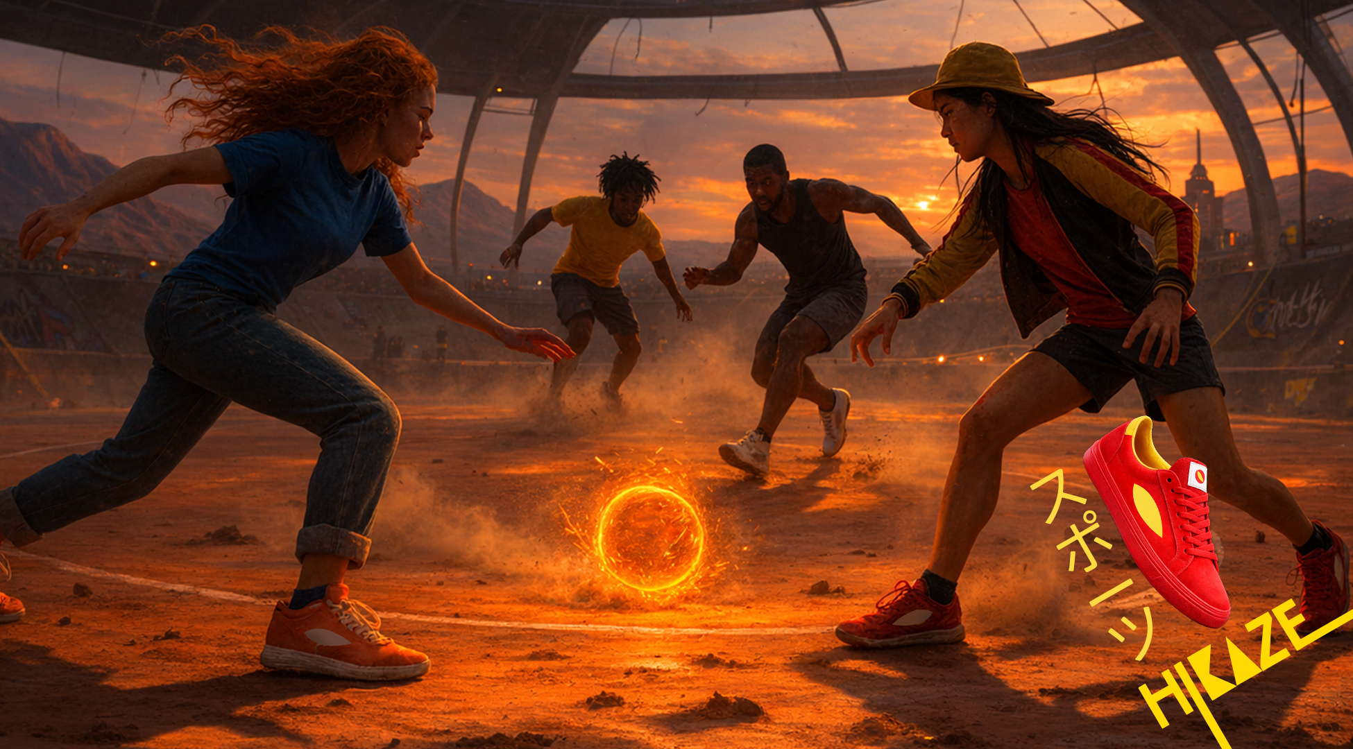
Reels:
Single-minded proposition:
Hikaze: the footwear that carries the energy of moving together.
Territory:
Shared rituals that bind and charge the group. Where energy becomes connection.
Hikaze lives in repetition, where calm holds space and movement creates meaning.
Keywords
Ritual · Collective energy · Repetition · Belonging · Calm power
Insight:
Belonging isn’t about standing out.
It’s about moving in sync.
Groups create their own rituals: small, repeated moments that build connection.
That’s Hikaze.
Activation:
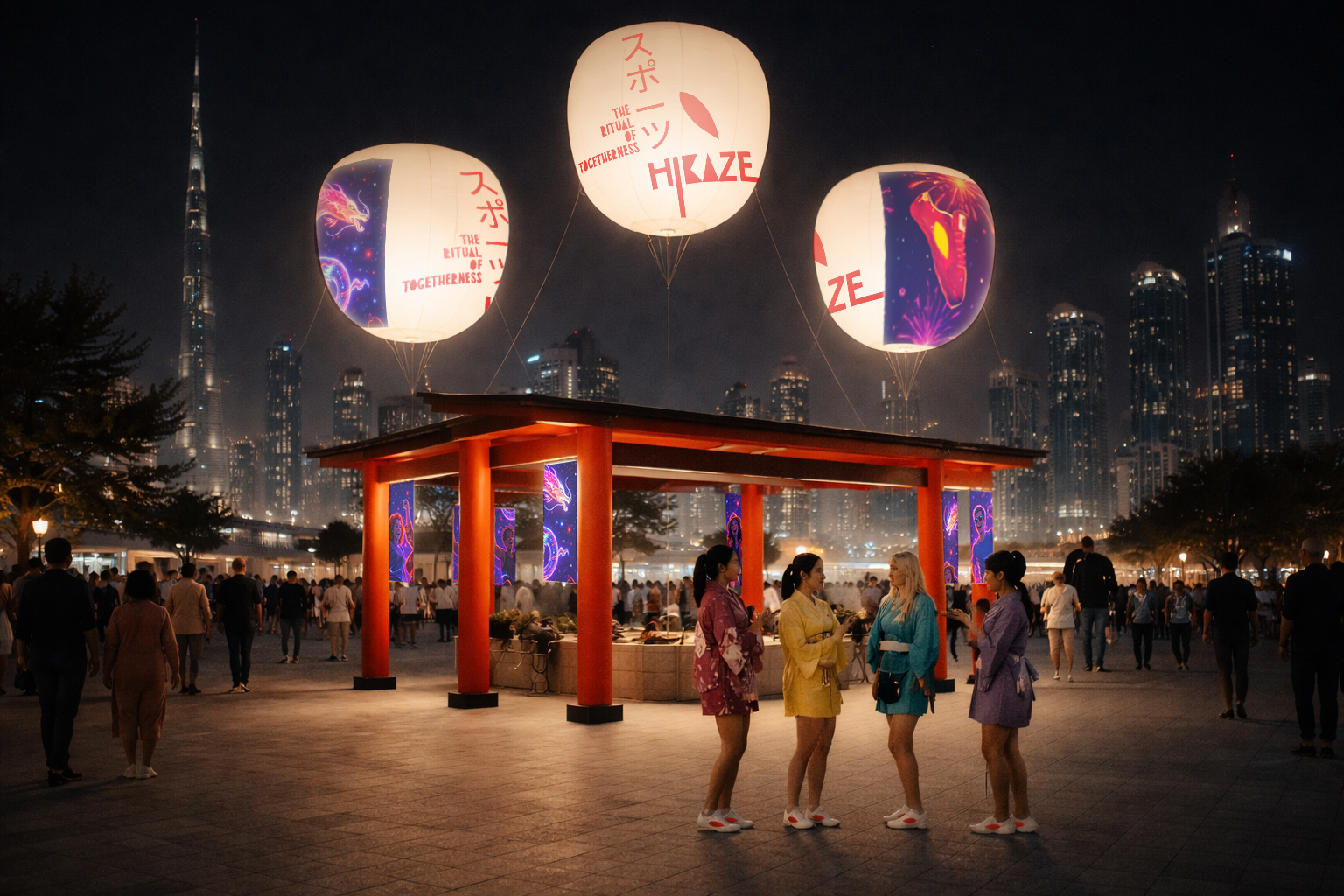
The Ritual of Togetherness
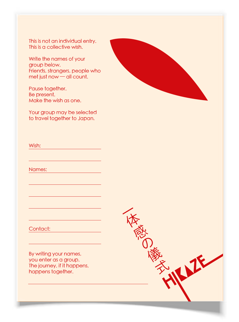
A physical ritual that turns collective energy into a chance to travel together — to Japan.
HOW IT WORKS:
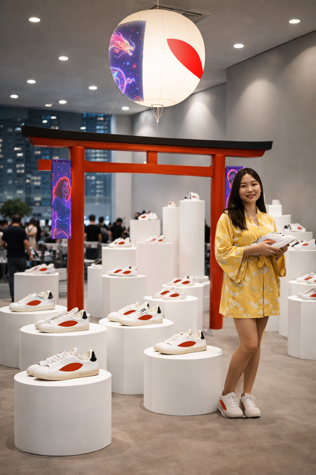
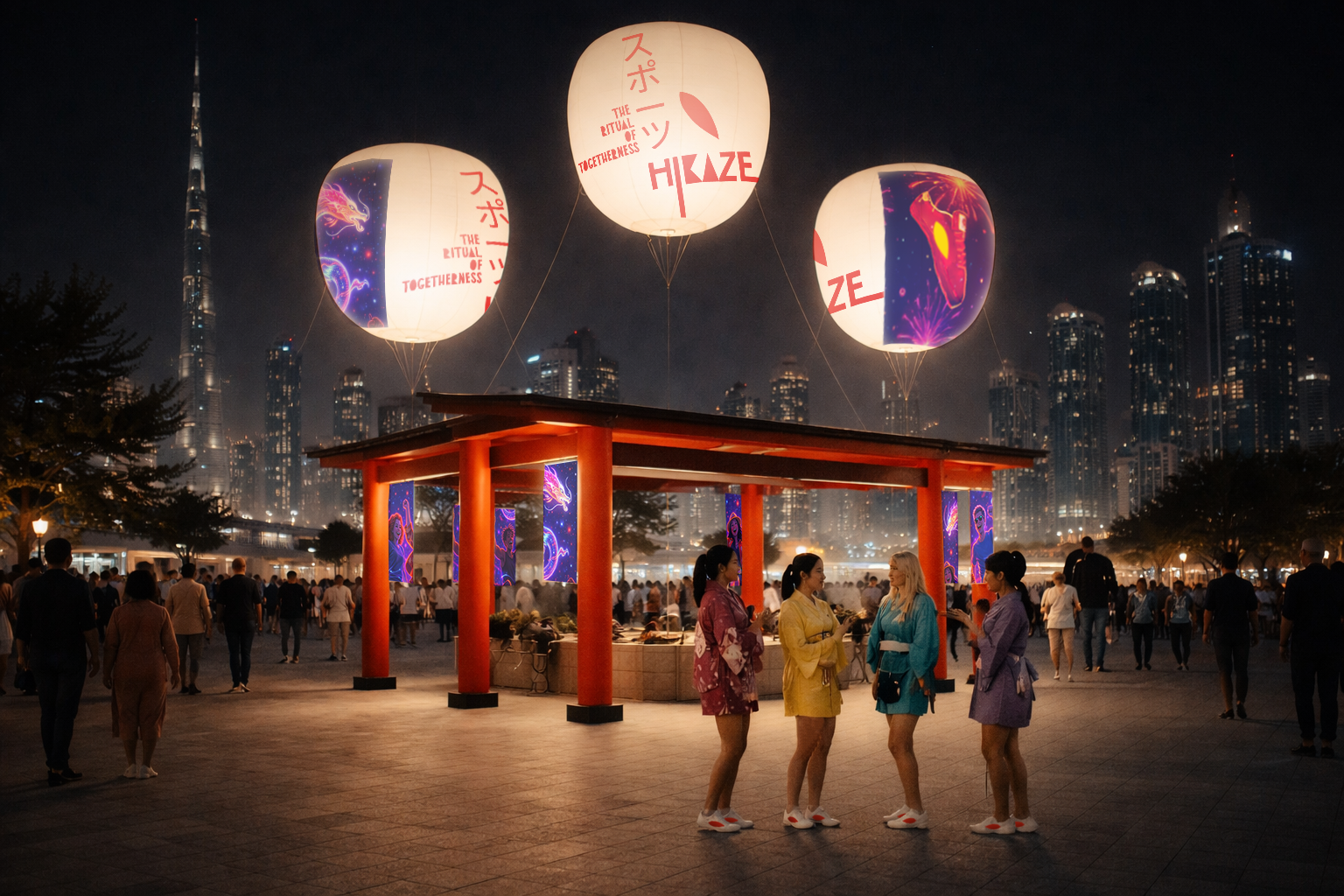
A Hikaze stand designed as a ritual space, inspired by Japanese collective practices. A place where groups pause, gather and make a wish together.
Not individual entries. Only groups*.
*The group can be created joining random people who are passing by.
OOH (Hikaze gate / Fair):
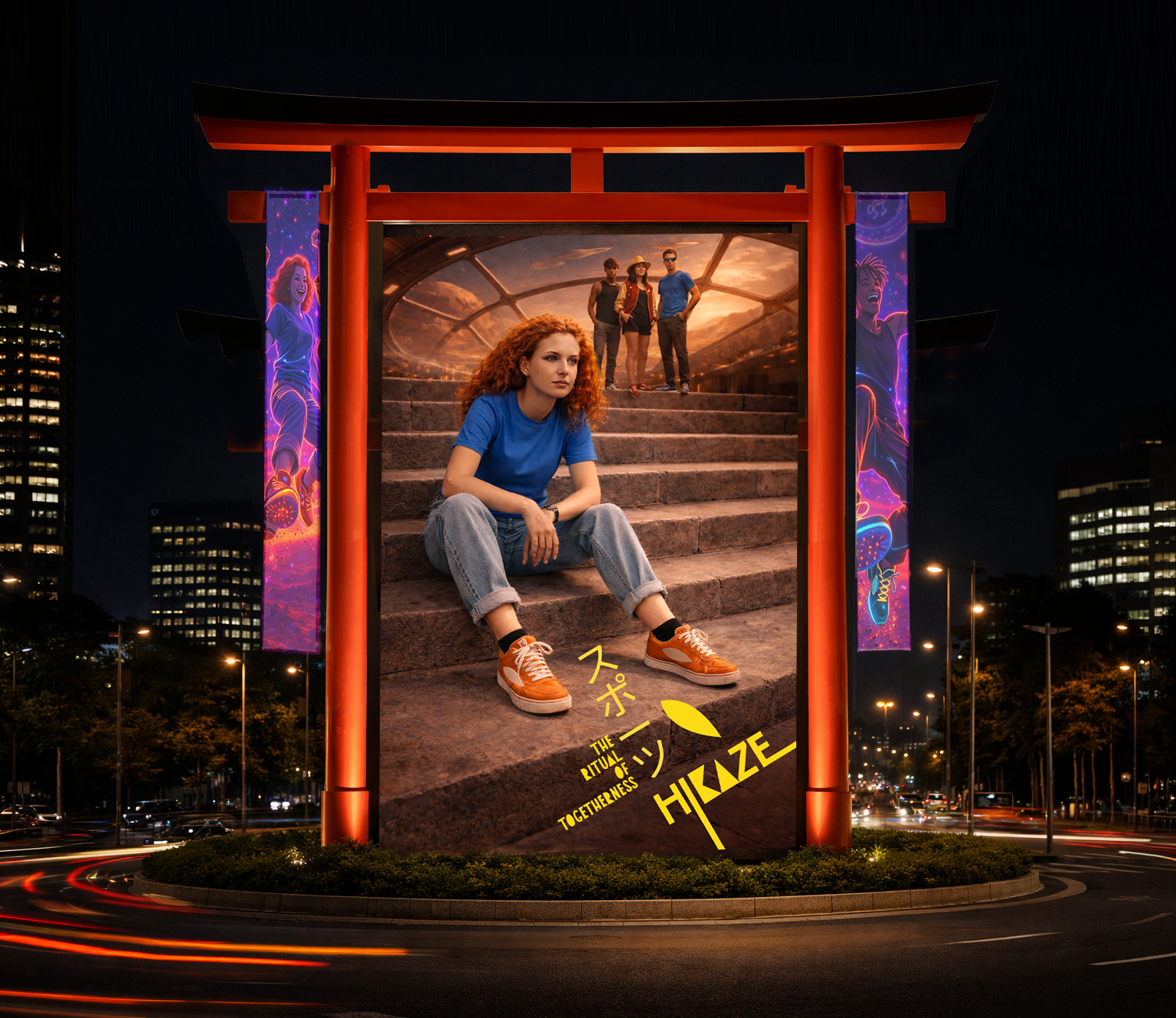
In-store:
A ritual space
The store becomes a calm, charged environment. A place for intention. Symbols are composed to create a ritual space, where shopping becomes almost ceremonial moment.
Every element reinforces presence, repetition and japanese elements.
Launching strategy:
Display one product per day = focus on the brand icon.
Core principle
White space + one point of energy
Inspired by the Japanese flag:
White → calm, respect, clarity
Red → energy, focus, togetherness
Reinterpreted through Hikaze:
White as the dominant space
Red as the energy meets wind moment