


More to see
A campaign and visual identity system built around the consequences of vision loss.
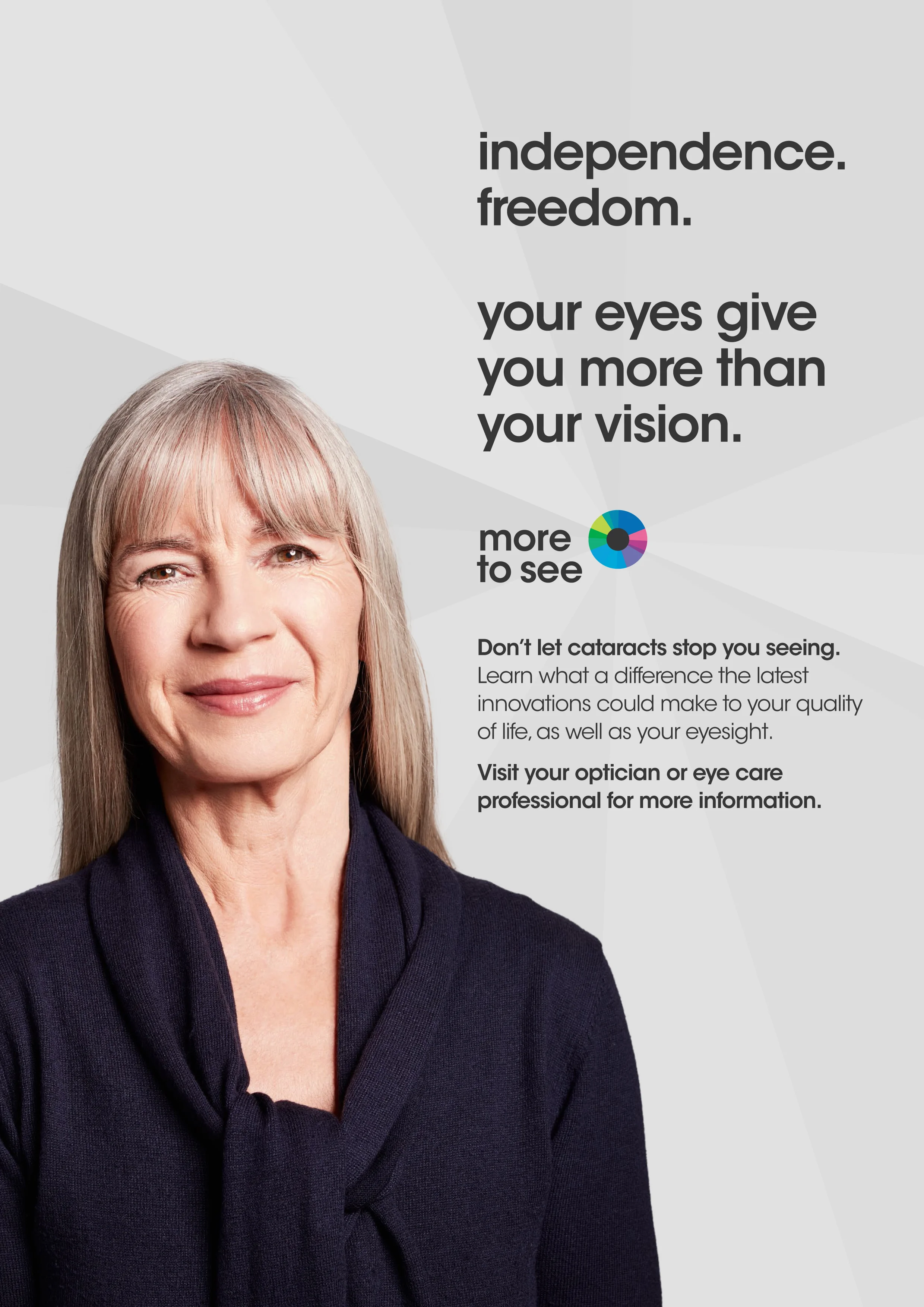
Designed to translate a medical condition into something human, immediate and emotionally visible.
System
A campaign framework combining storytelling, brand design and visual language.
Built to connect real lives with the progressive loss of sight, using clarity and restraint to keep the message direct and accessible.
Designed to scale across campaign assets while maintaining emotional focus and consistency.
The system in action
From condition to consequence → Narrative
Reframing cataracts not as a clinical definition, but as a gradual disappearance of lived experience.
Each asset focused on what becomes unreachable as vision fades.
Human focus → Art direction
Working with real individuals and their stories.
Simple, direct compositions that prioritize presence over explanation.
Visual identity + design → Brand system
Designed and developed the visual language of the campaign, including logo treatment, layout logic and supporting design system.
A restrained identity that reinforces clarity and emotional weight across formats.
Outcome
A pitch-winning campaign positioning cataracts as a human and emotional issue rather than a purely medical one.
A clear creative platform for awareness, built through a combination of art direction and brand design.