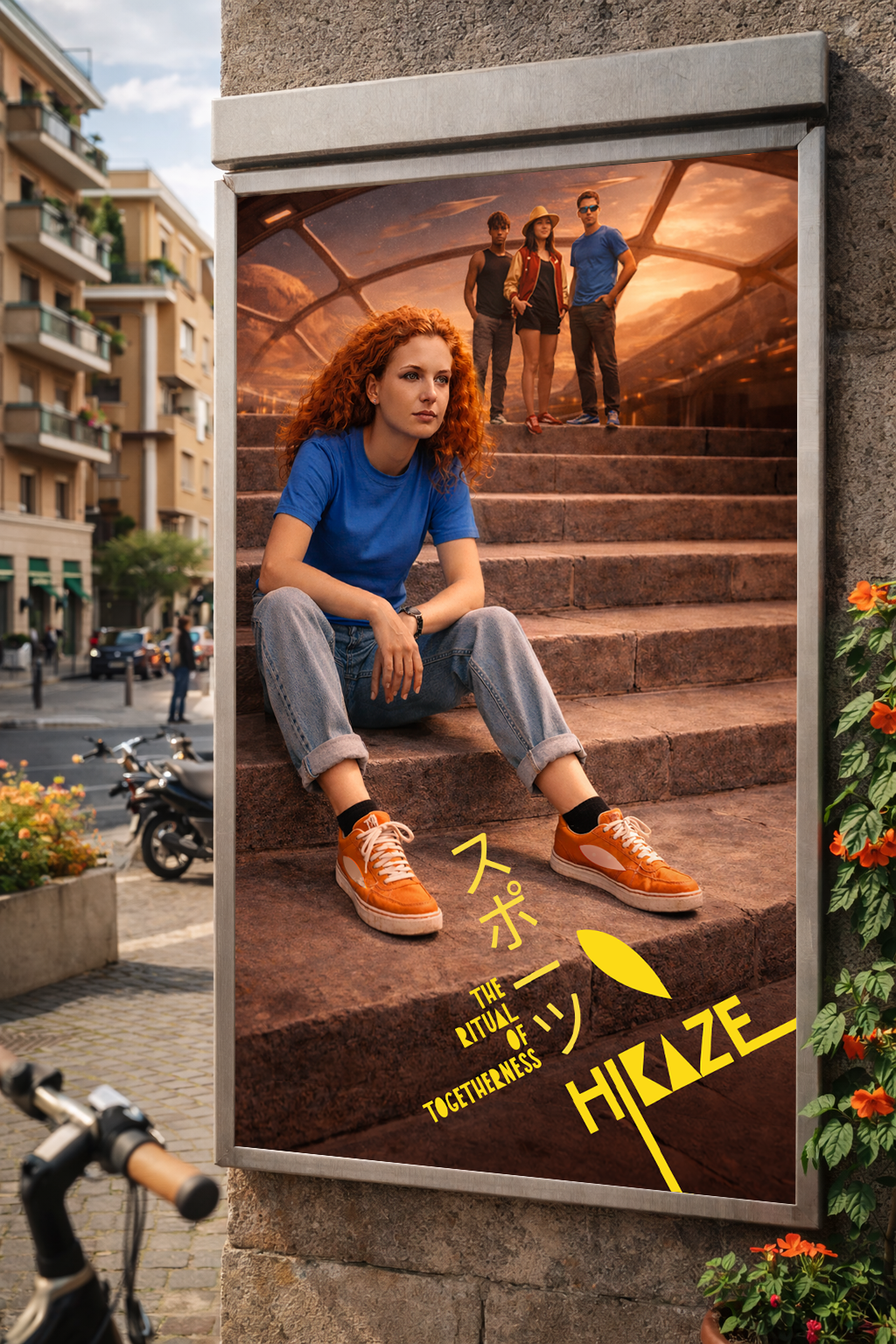
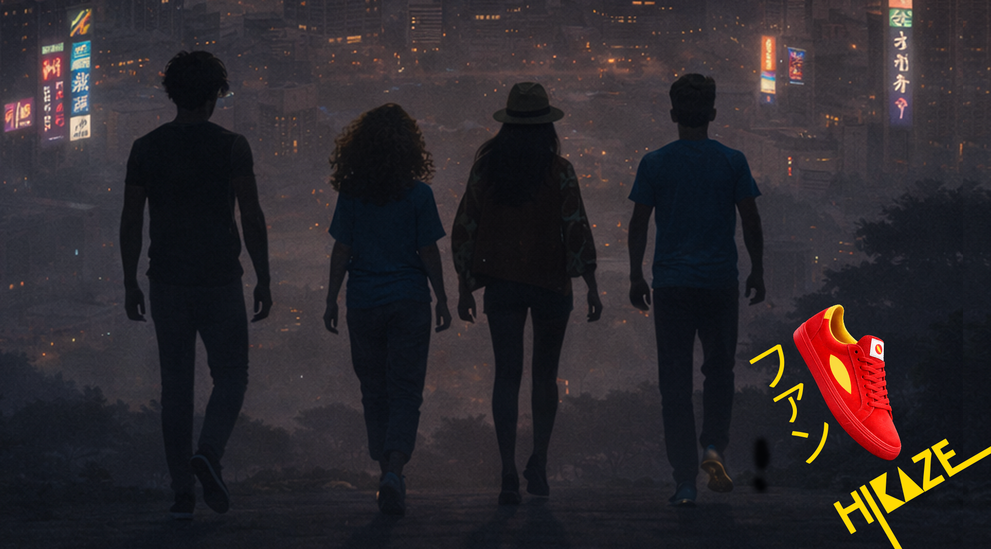
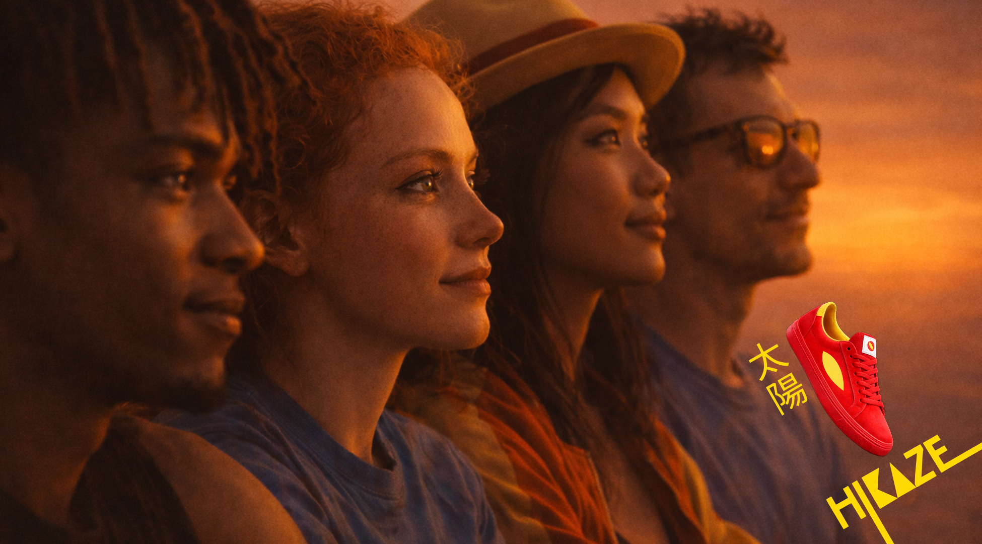
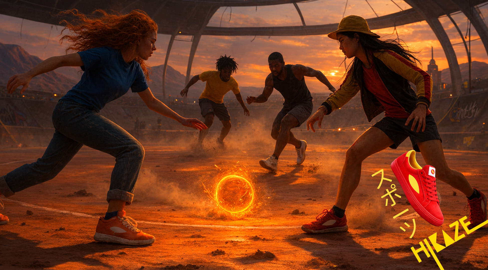
The power of together
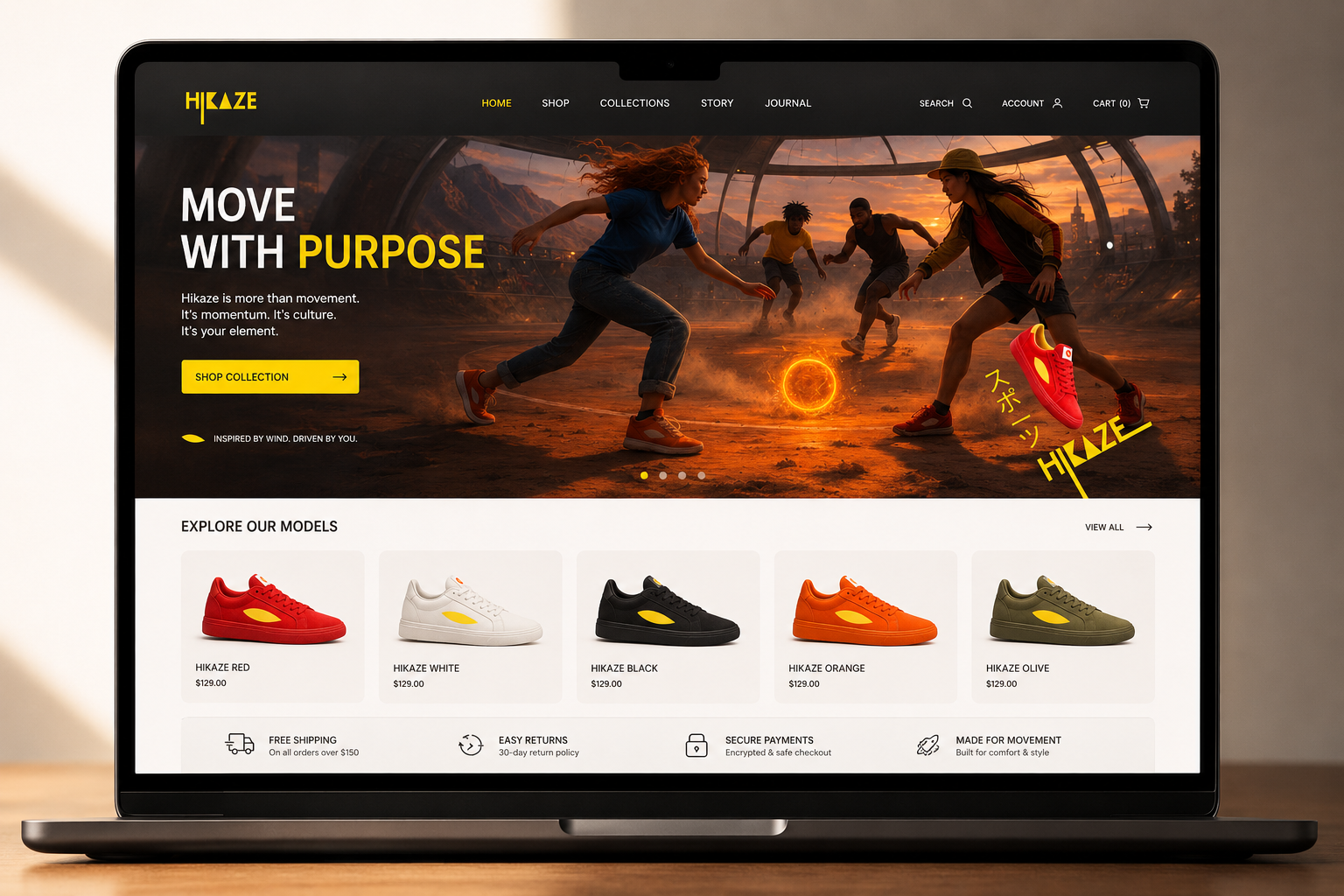
Hikaze. Footwear designed for shared momentum.
My role: Ideation Creative, Art Direction, Concept Design, Brand Design, AI photo generation, Edition.
Hero film:
Key visuals:
Reels:
Single-minded proposition:
Hikaze: the footwear that carries the energy of moving together.
Territory:
Shared rituals that bind and charge the group. Where energy becomes connection.
Hikaze lives in repetition, where calm holds space and movement creates meaning.
Keywords
Ritual · Collective energy · Repetition · Belonging · Calm power
Insight:
Belonging isn’t about standing out.
It’s about moving in sync.
Groups create their own rituals: small, repeated moments that build connection.
That’s Hikaze.
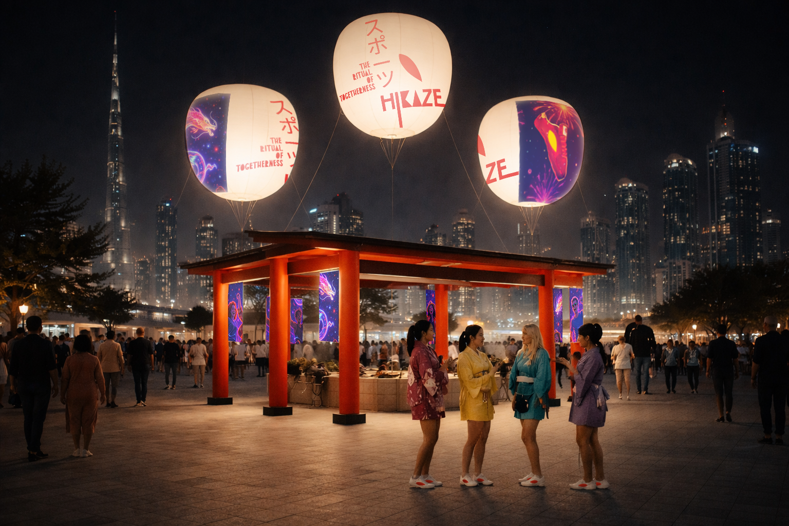
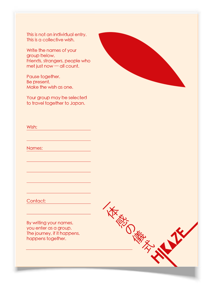
Activation:

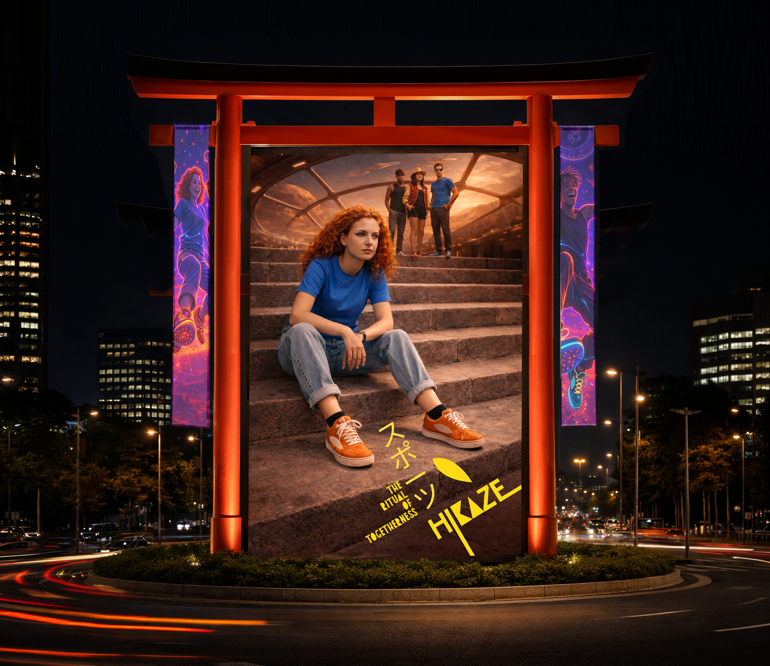
The Ritual of Togetherness
A physical ritual that turns collective energy into a chance to travel together — to Japan.
HOW IT WORKS:
A Hikaze stand designed as a ritual space, inspired by Japanese collective practices. A place where groups pause, gather and make a wish together.
Not individual entries. Only groups*.
*The group can be created joining random people who are passing by.
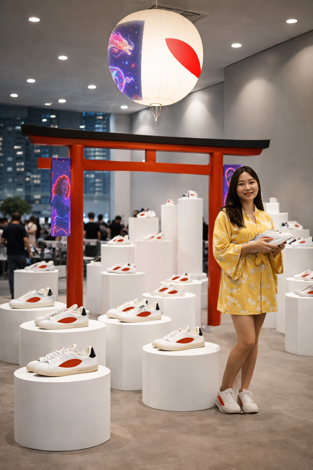
OOH (Hikaze gate / Fair):
In-store:
A ritual space
The store becomes a calm, charged environment. A place for intention. Symbols are composed to create a ritual space, where shopping becomes almost ceremonial moment.
Every element reinforces presence, repetition and japanese elements.
Launching strategy:
Display one product per day = focus on the brand icon.
Core principle
White space + one point of energy
Inspired by the Japanese flag:
White → calm, respect, clarity
Red → energy, focus, togetherness
Reinterpreted through Hikaze:
White as the dominant space
Red as the energy meets wind moment