The power of together
Transmedia Brand Experience System
Hikaze is a footwear brand experience designed around a core belief: belonging is not individual expression, but collective movement. The project transforms product communication into a shared ritual system across physical spaces, digital touchpoints and storytelling environments.
The work explores how repetition, ritual and synchronized action can become a narrative structure that connects people, brands and spaces.
THE RITUAL OF TOGETHERNESS
A transmedia activation system that turns collective participation into a pathway for shared experience and reward.
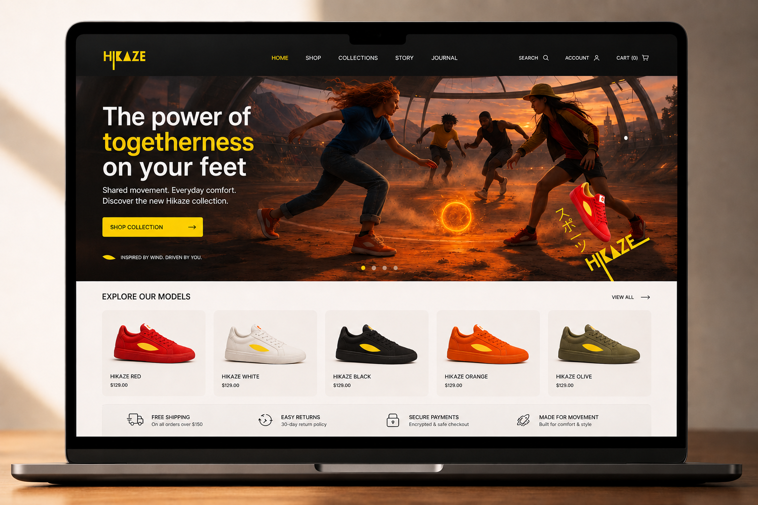
DIGITAL PLATFORM / ENTRY POINT
A campaign hub where users are introduced to the Hikaze philosophy of collective movement. The digital experience sets the narrative tone and invites groups to participate in a shared ritual rather than individual interaction. Participation is group-based only, reinforcing the core idea of collective energy.
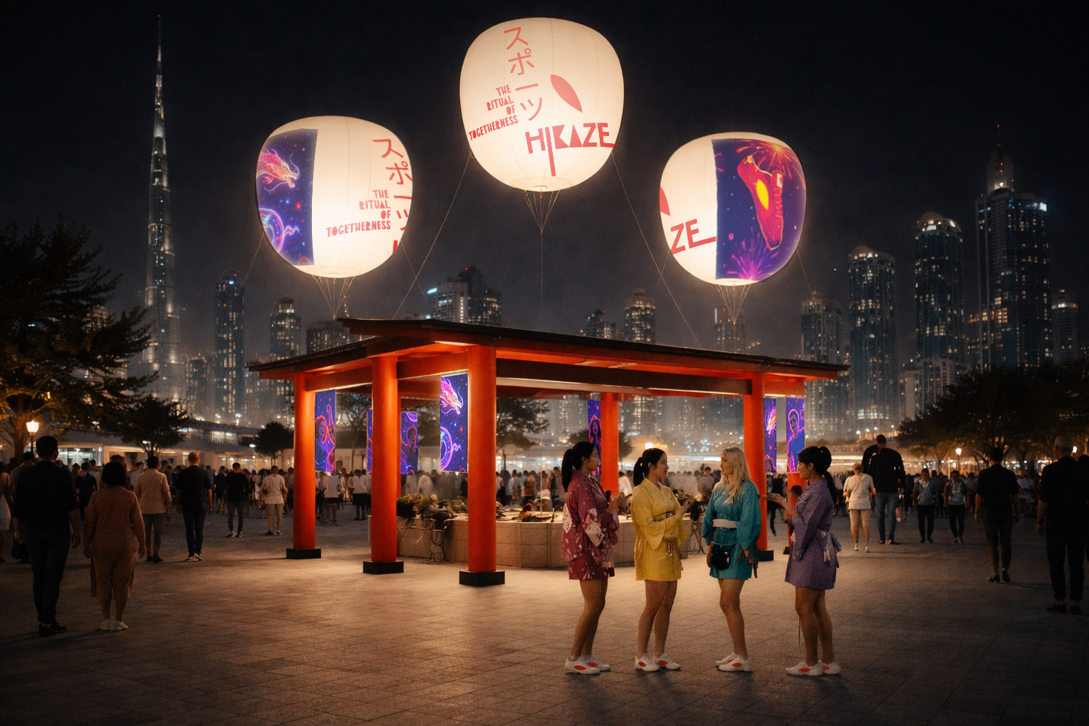
PHYSICAL ACTIVATION / RITUAL SPACE
A designed experiential installation inspired by Japanese collective rituals. The Hikaze stand acts as a “ritual gateway” where groups gather, pause and participate in a shared action.
Only groups can activate the experience — including spontaneous groups formed on-site — reinforcing connection between strangers and shared intention.
The activation becomes a physical expression of the brand belief: movement only gains meaning when shared.
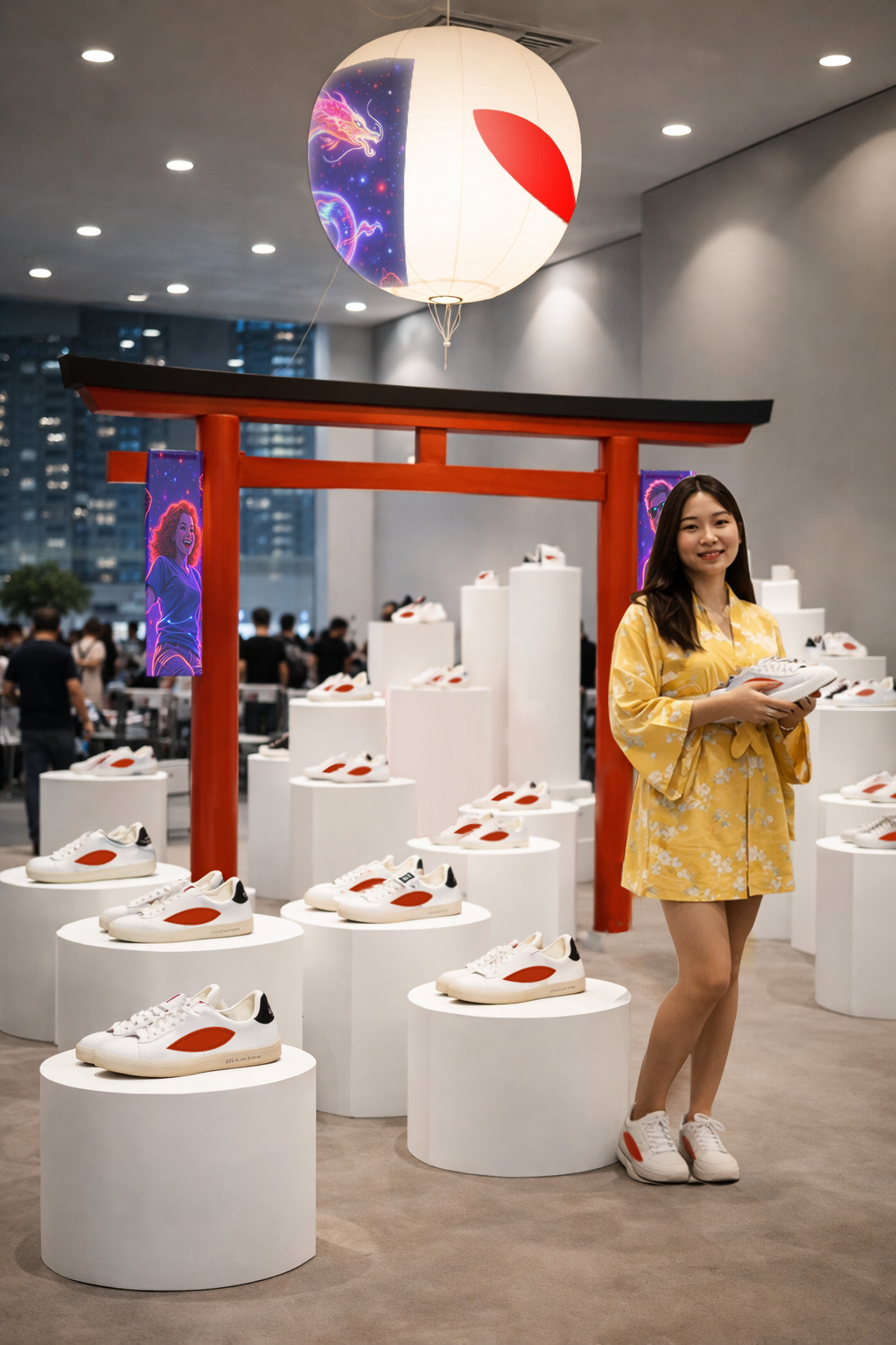
RETAIL EXPERIENCE / ENVIRONMENTAL DESIGN
The store is transformed into a calm, ceremonial space where shopping becomes a ritual of intention. Each interaction is slowed, structured and symbolic, reinforcing presence and collective energy through repetition and spatial design.
PRODUCT STRATEGY / FOCUS SYSTEM
A controlled product storytelling system where only one product is highlighted per day, reinforcing focus, clarity and emotional attention toward the brand icon.
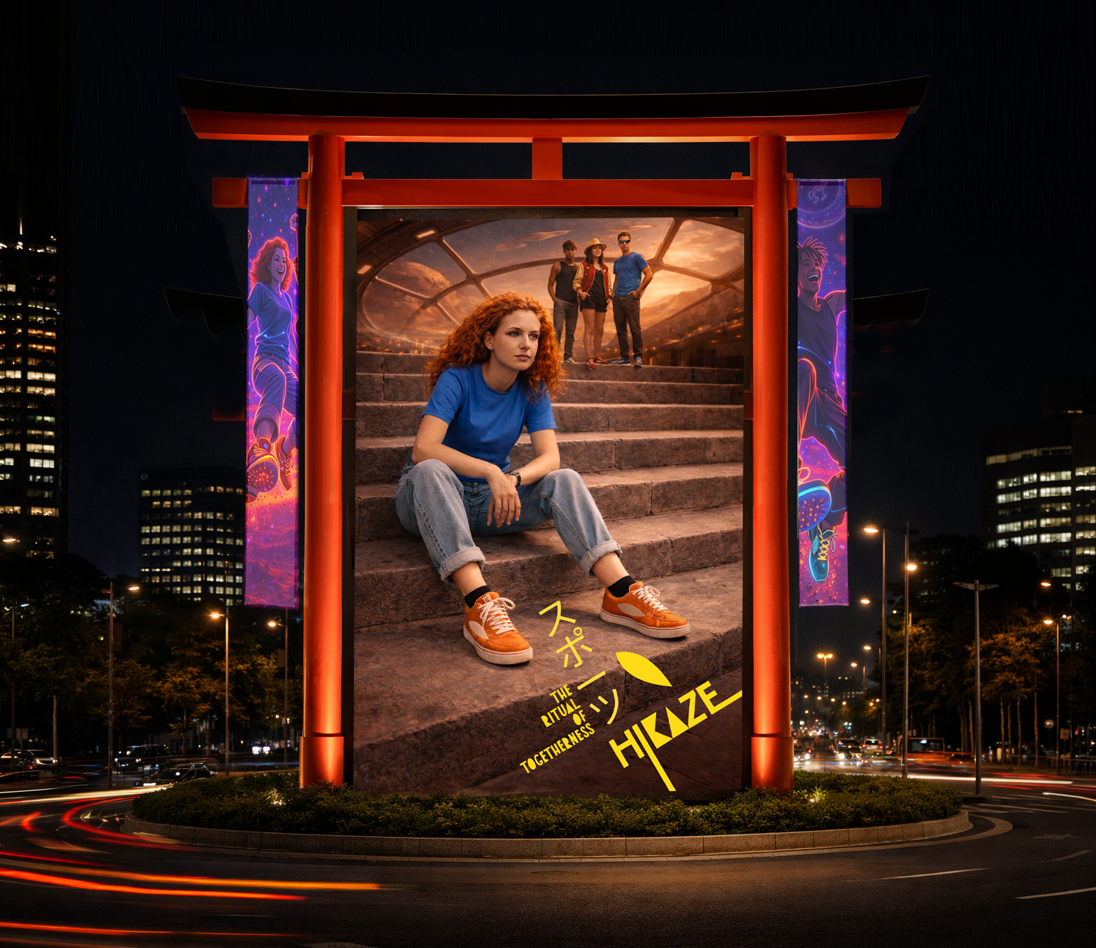
COMMUNICATION SYSTEM / OOH & CAMPAIGN
Outdoor and campaign assets extend the ritual logic into public space. Minimal, high-contrast compositions communicating calm, focus and collective movement.
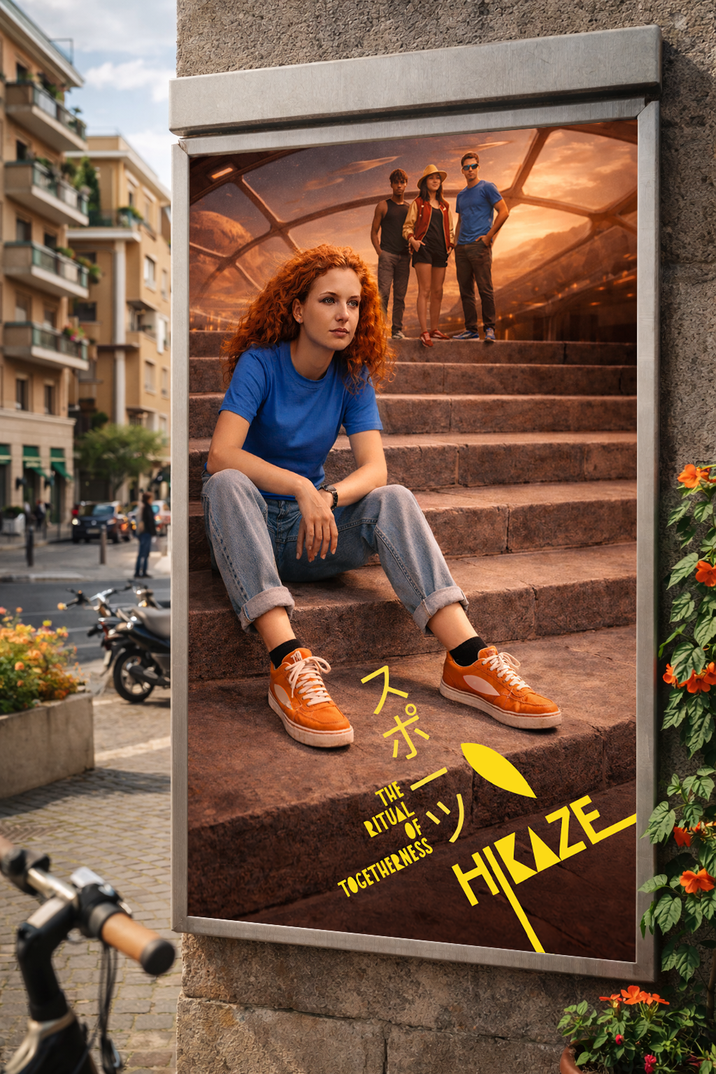
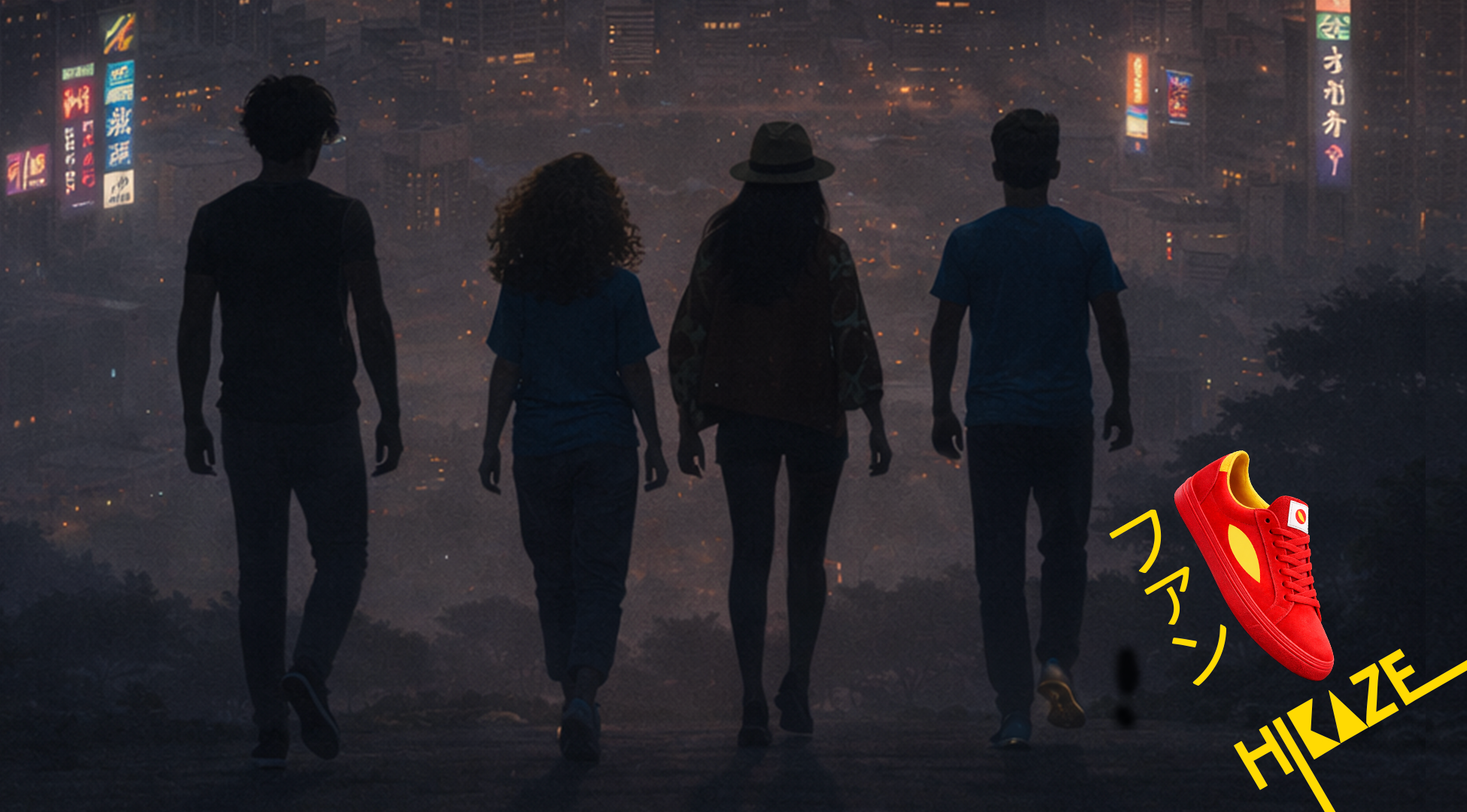
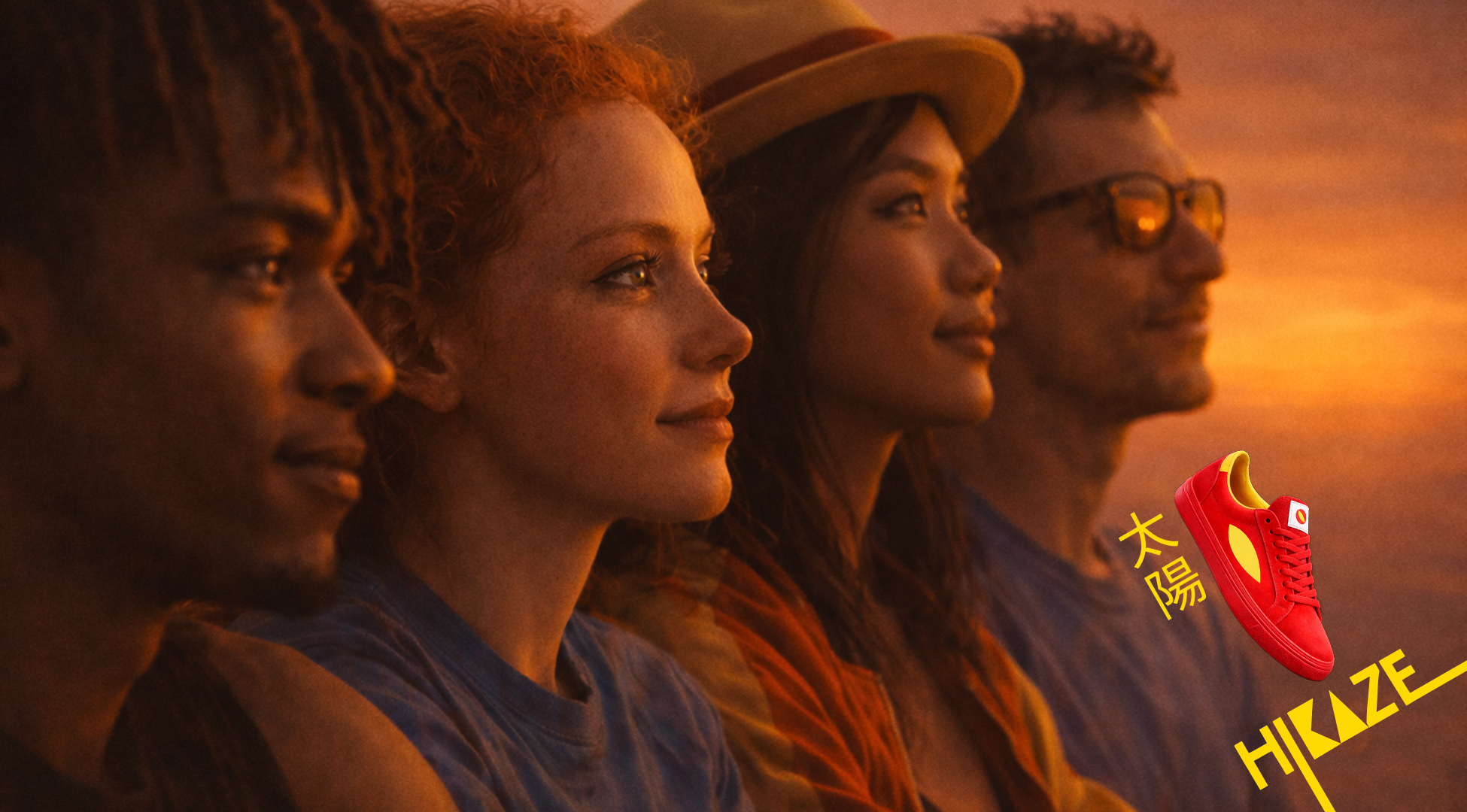
STORYTELLING / FILM & SOCIAL CONTENT
Hero film and social content expand the narrative of collective movement, showing how groups form, connect and move in sync. Content reinforces the emotional territory of belonging through shared rhythm and repetition.
CORE IDEA
Hikaze: the footwear that carries the energy of moving together.
CREATIVE TERRITORY
Shared rituals that transform individual presence into collective energy.
My role: Ideation Creative, Art Direction, Concept Design, Brand Design, AI photo generation, Edit.
Creative agency: Independent
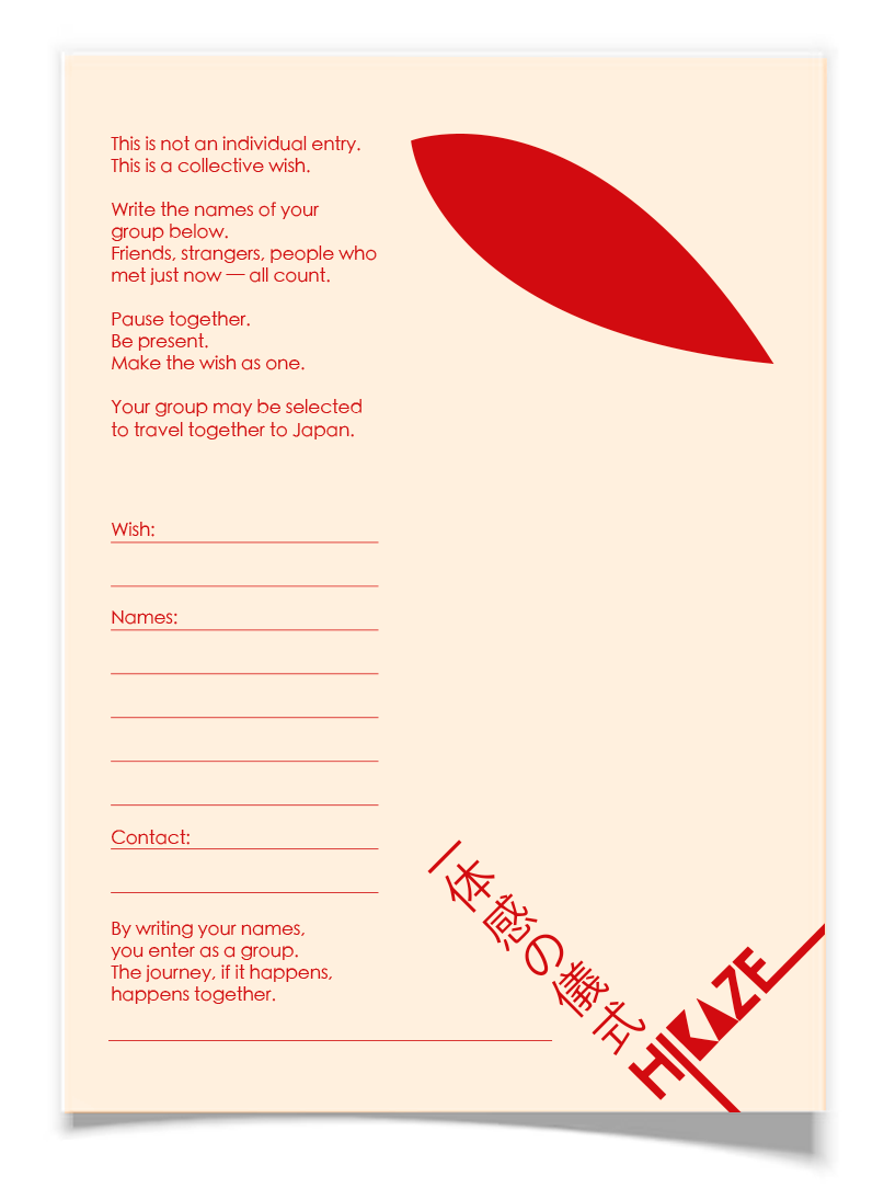
Activation:

The Ritual of Togetherness
A physical ritual that turns collective energy into a chance to travel together — to Japan.
HOW IT WORKS:
A Hikaze stand designed as a ritual space, inspired by Japanese collective practices. A place where groups pause, gather and make a wish together.
Not individual entries. Only groups*.
*The group can be created joining random people who are passing by.
Hero Film:
Key visuals:
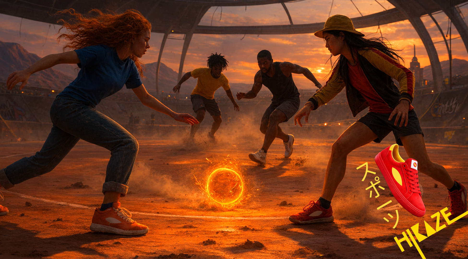
Reels:
Single-minded proposition:
Hikaze: the footwear that carries the energy of moving together.
Territory:
Shared rituals that bind and charge the group. Where energy becomes connection.
Hikaze lives in repetition, where calm holds space and movement creates meaning.
Keywords
Ritual · Collective energy · Repetition · Belonging · Calm power
Insight:
Belonging isn’t about standing out.
It’s about moving in sync.
Groups create their own rituals: small, repeated moments that build connection.
That’s Hikaze.
OOH (Hikaze’s gate of the fair):
In-store:
A ritual space
The store becomes a calm, charged environment. A place for intention. Symbols are composed to create a ritual space, where shopping becomes almost ceremonial moment.
Every element reinforces presence, repetition and japanese elements.
Launching strategy:
Display one product per day = focus on the brand icon.
Core principle
White space + one point of energy
Inspired by the Japanese flag:
White → calm, respect, clarity
Red → energy, focus, togetherness
Reinterpreted through Hikaze:
White as the dominant space
Red as the energy meets wind moment