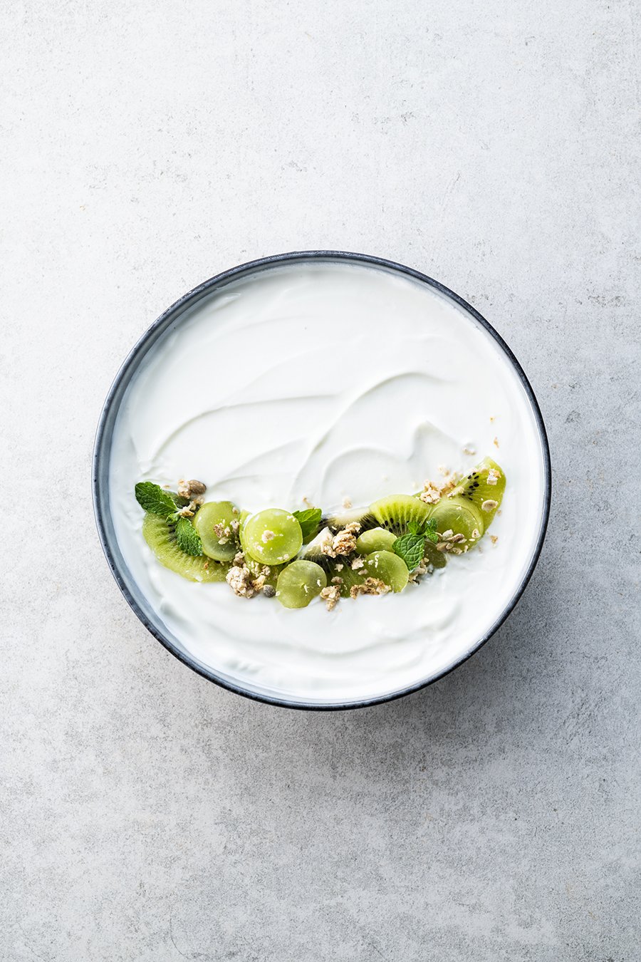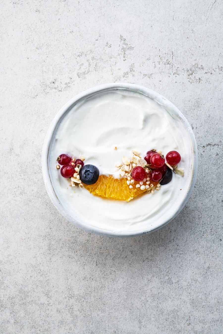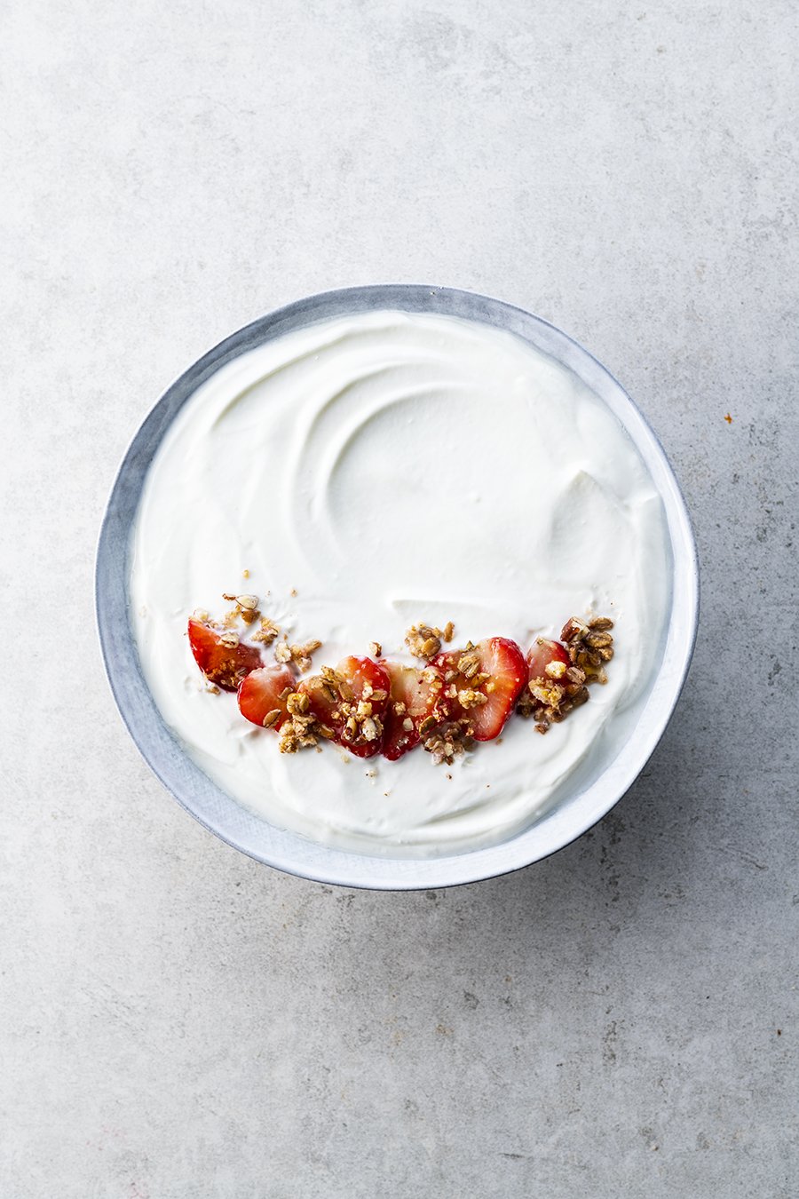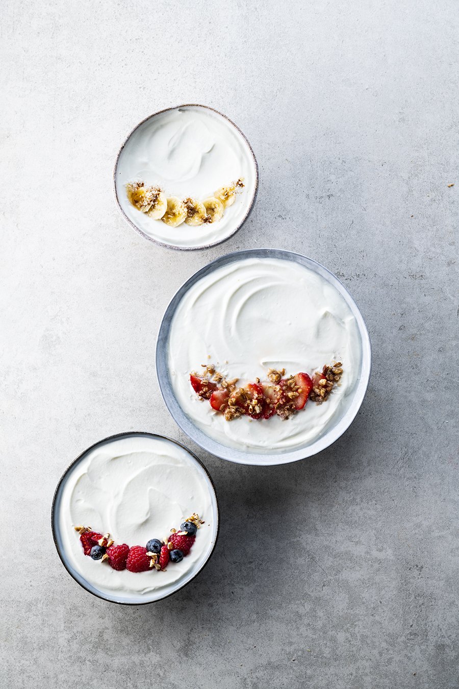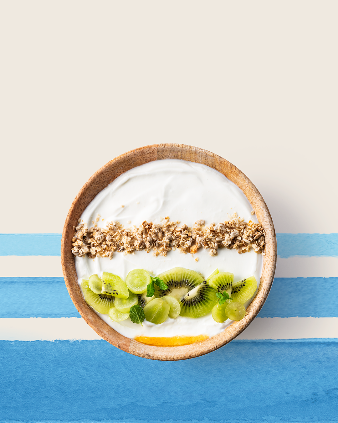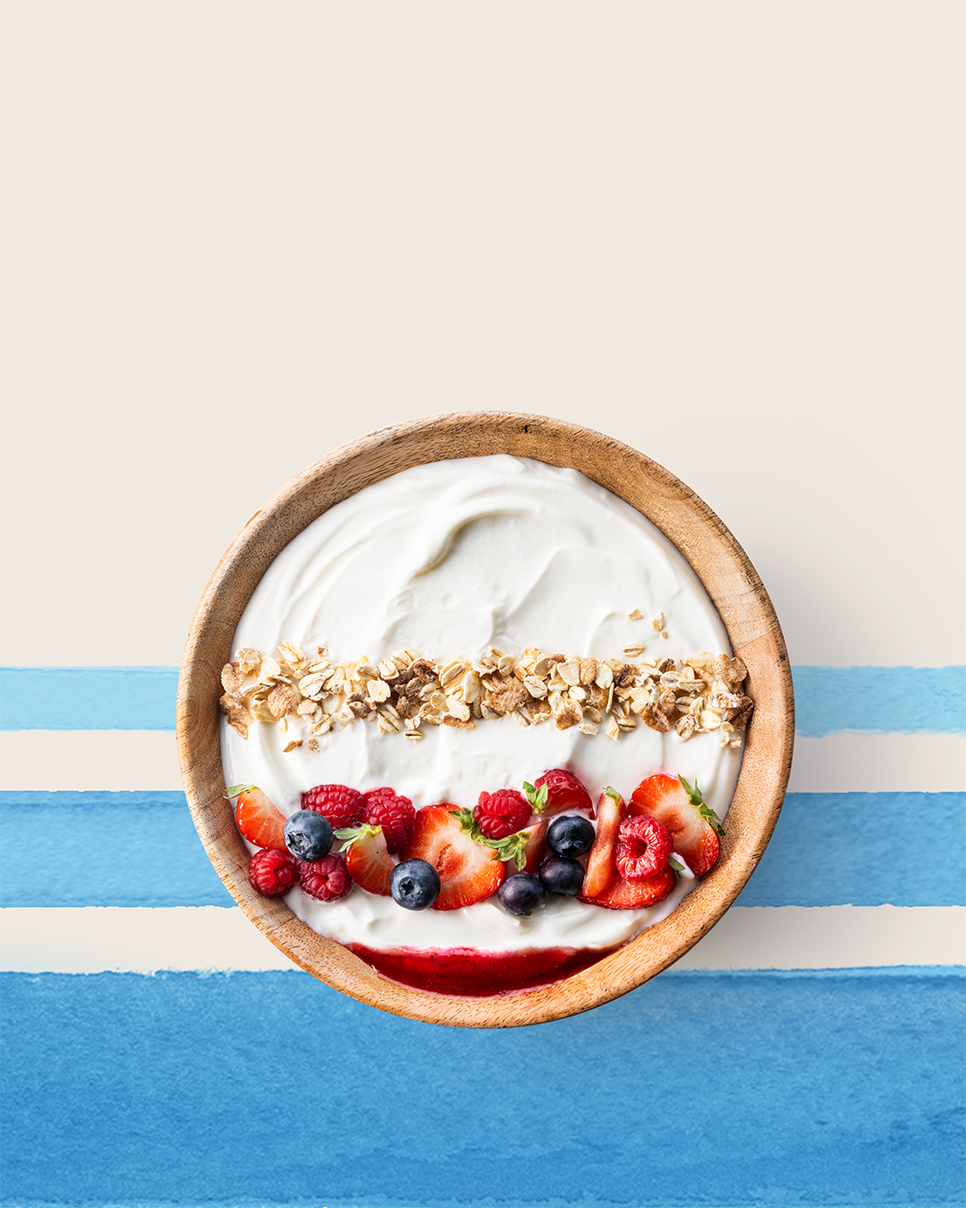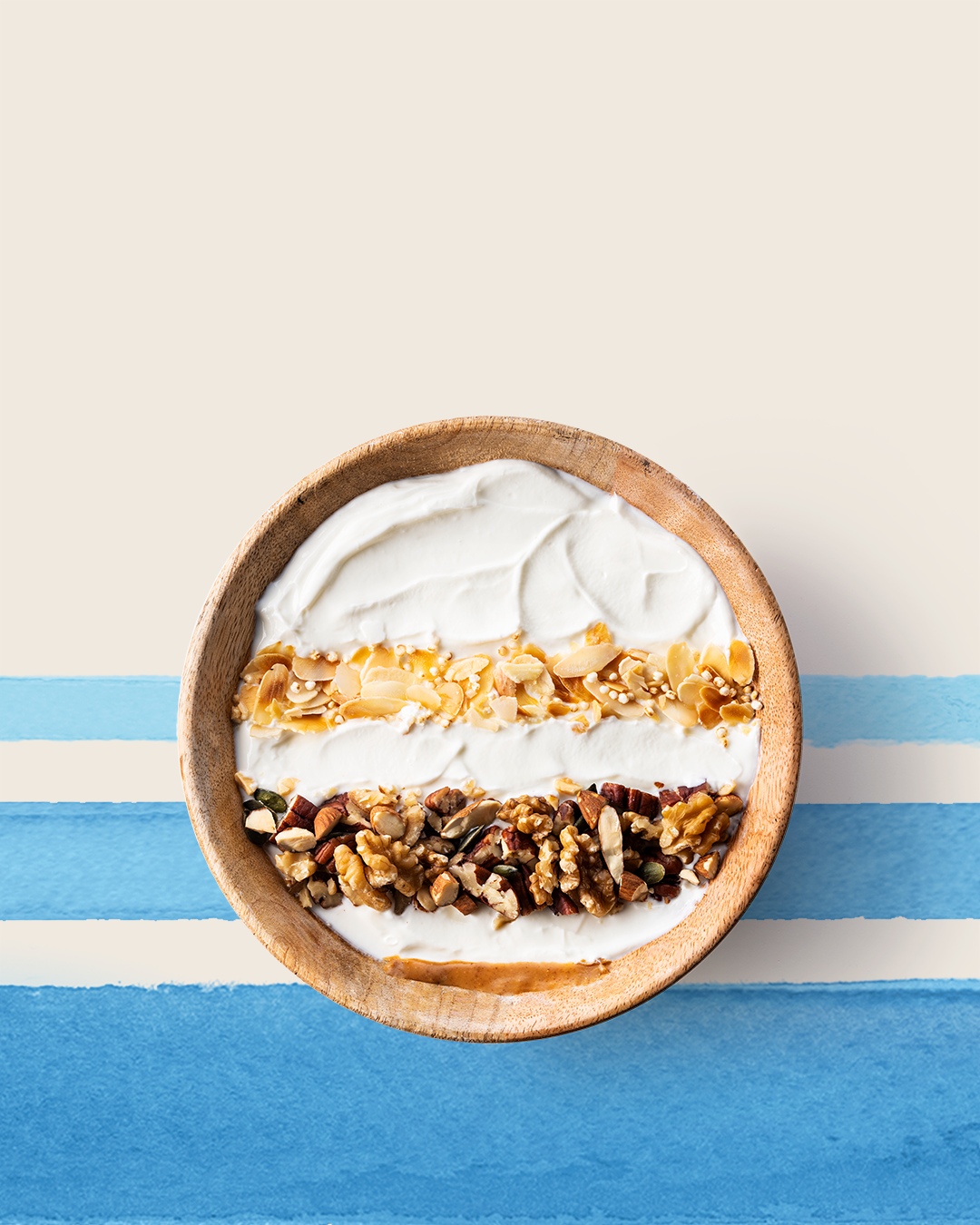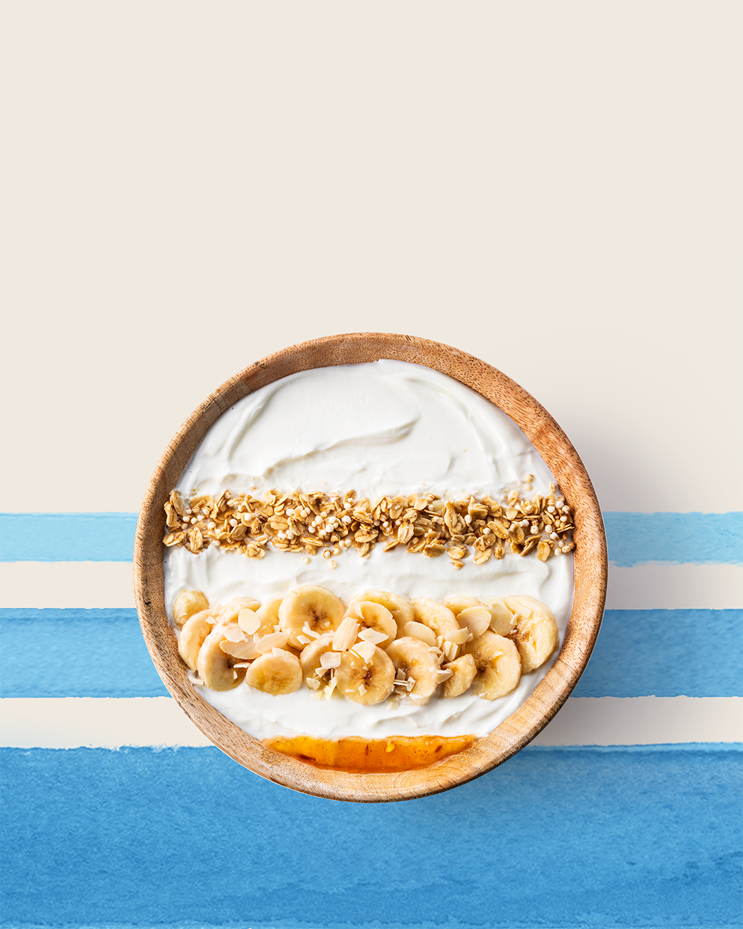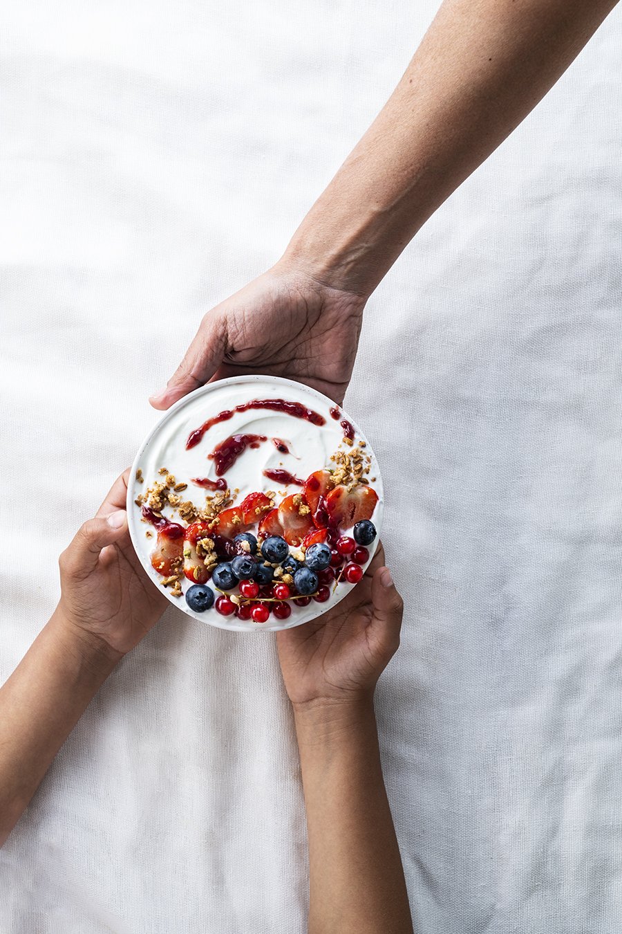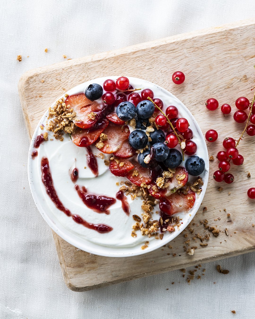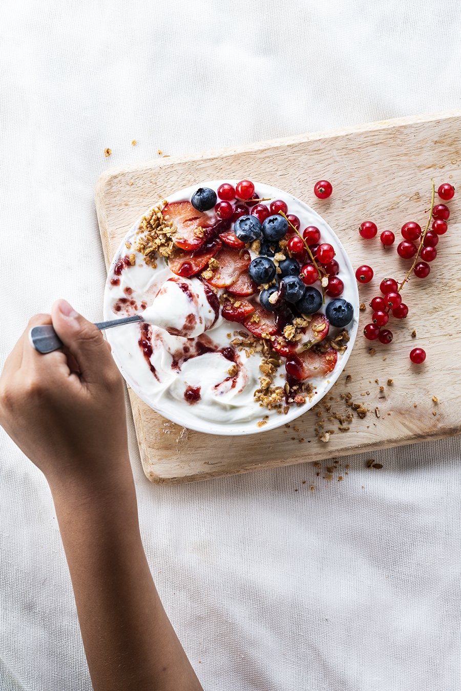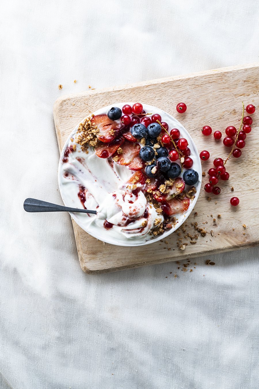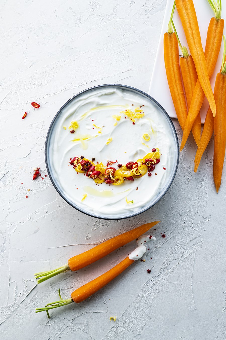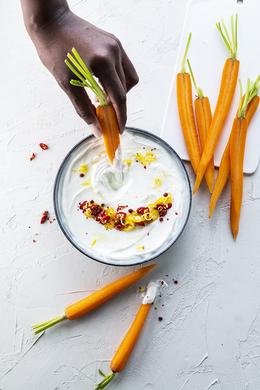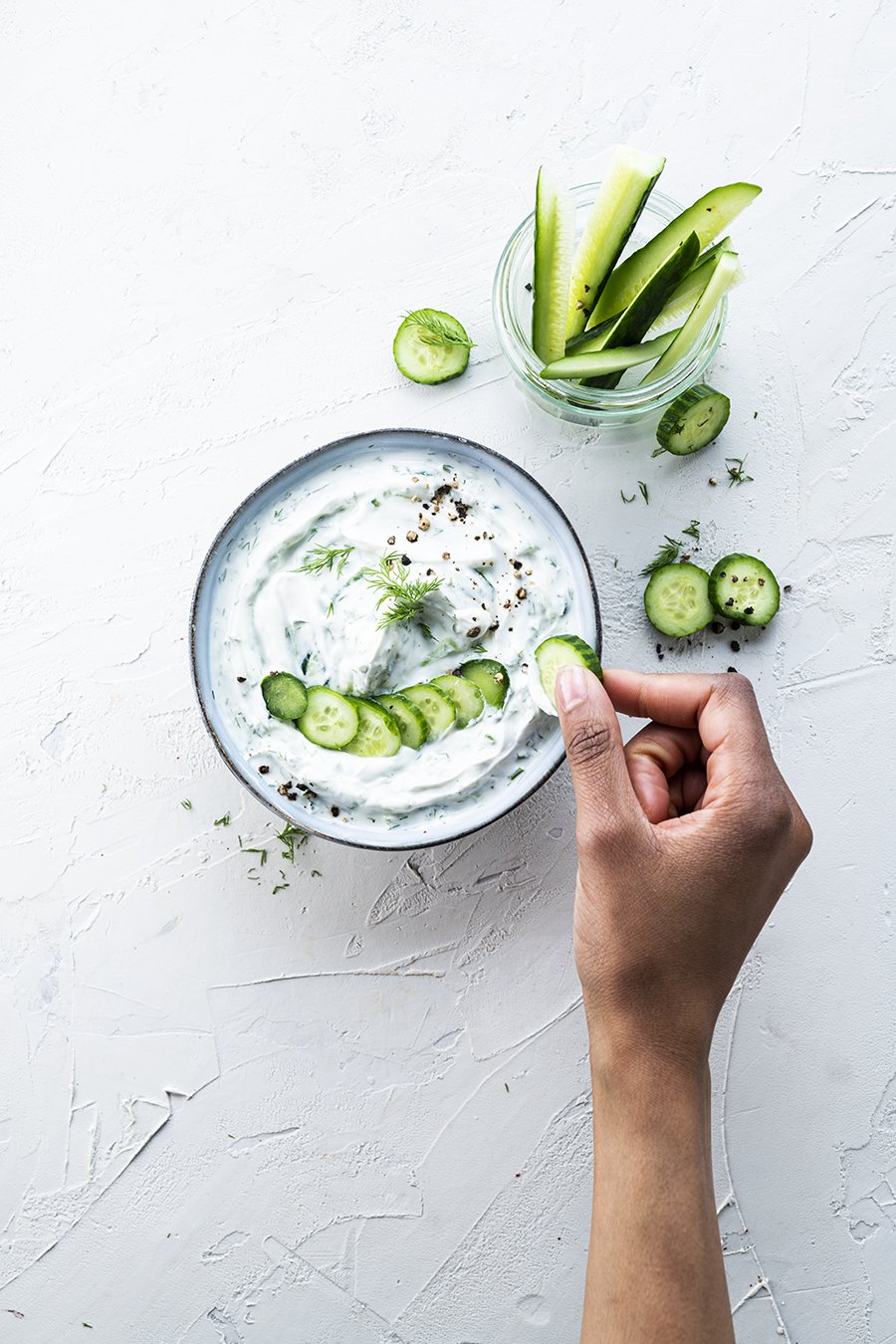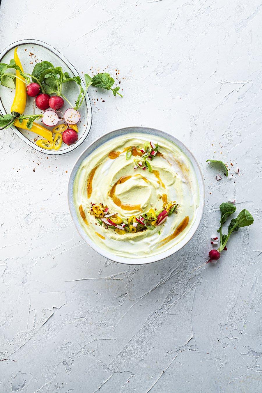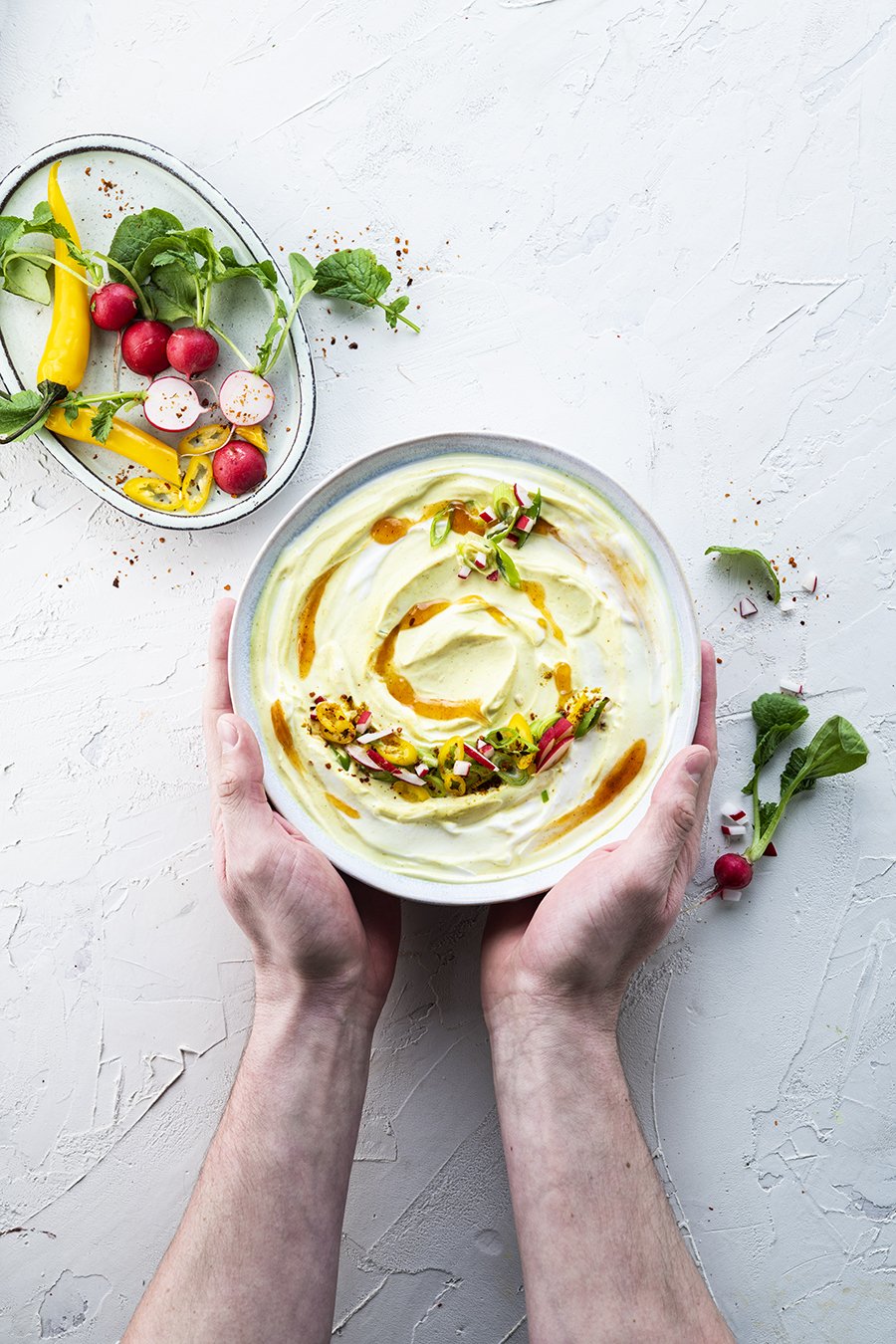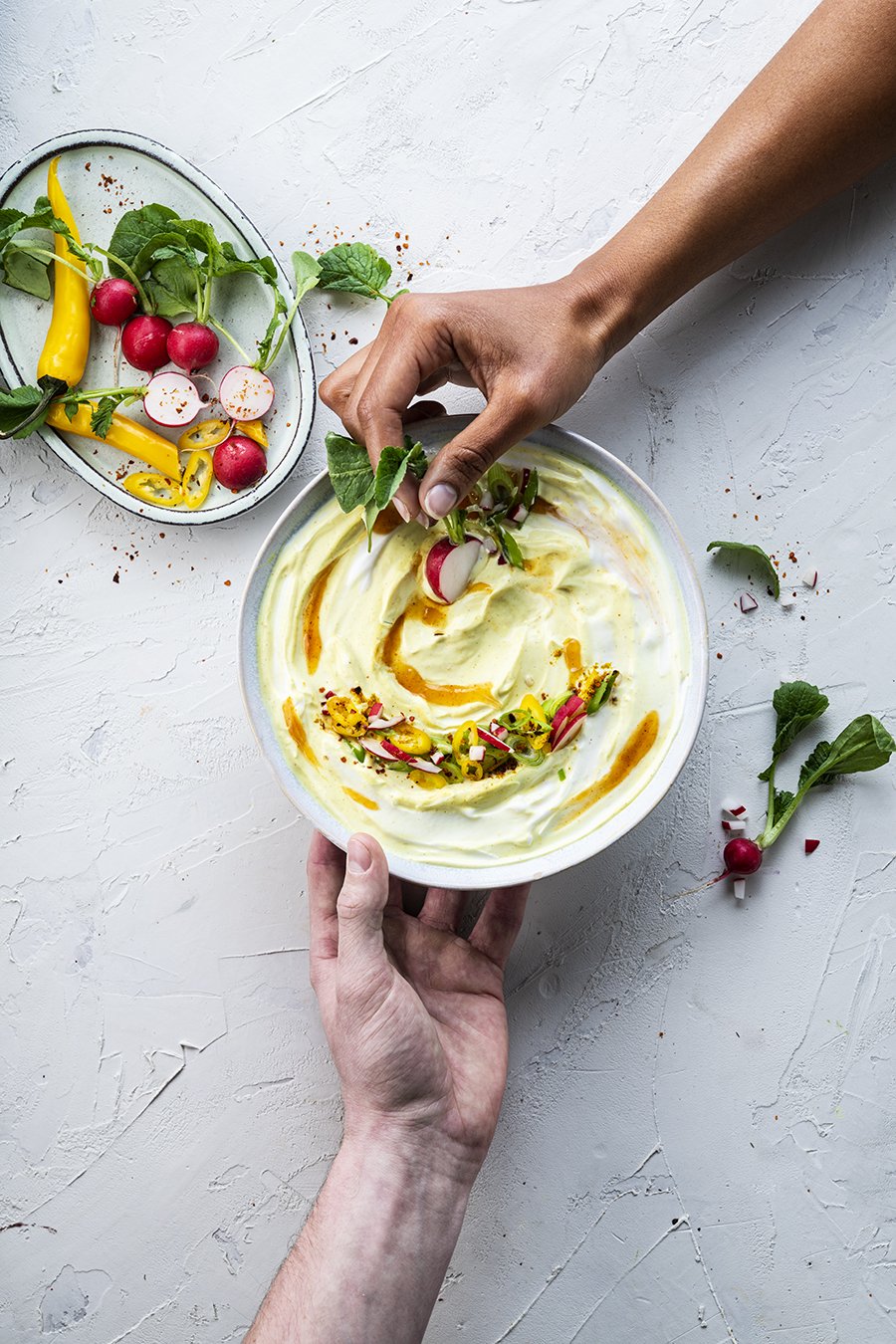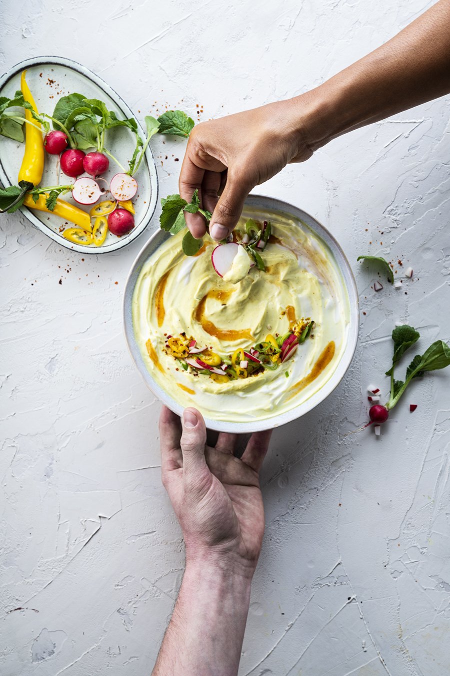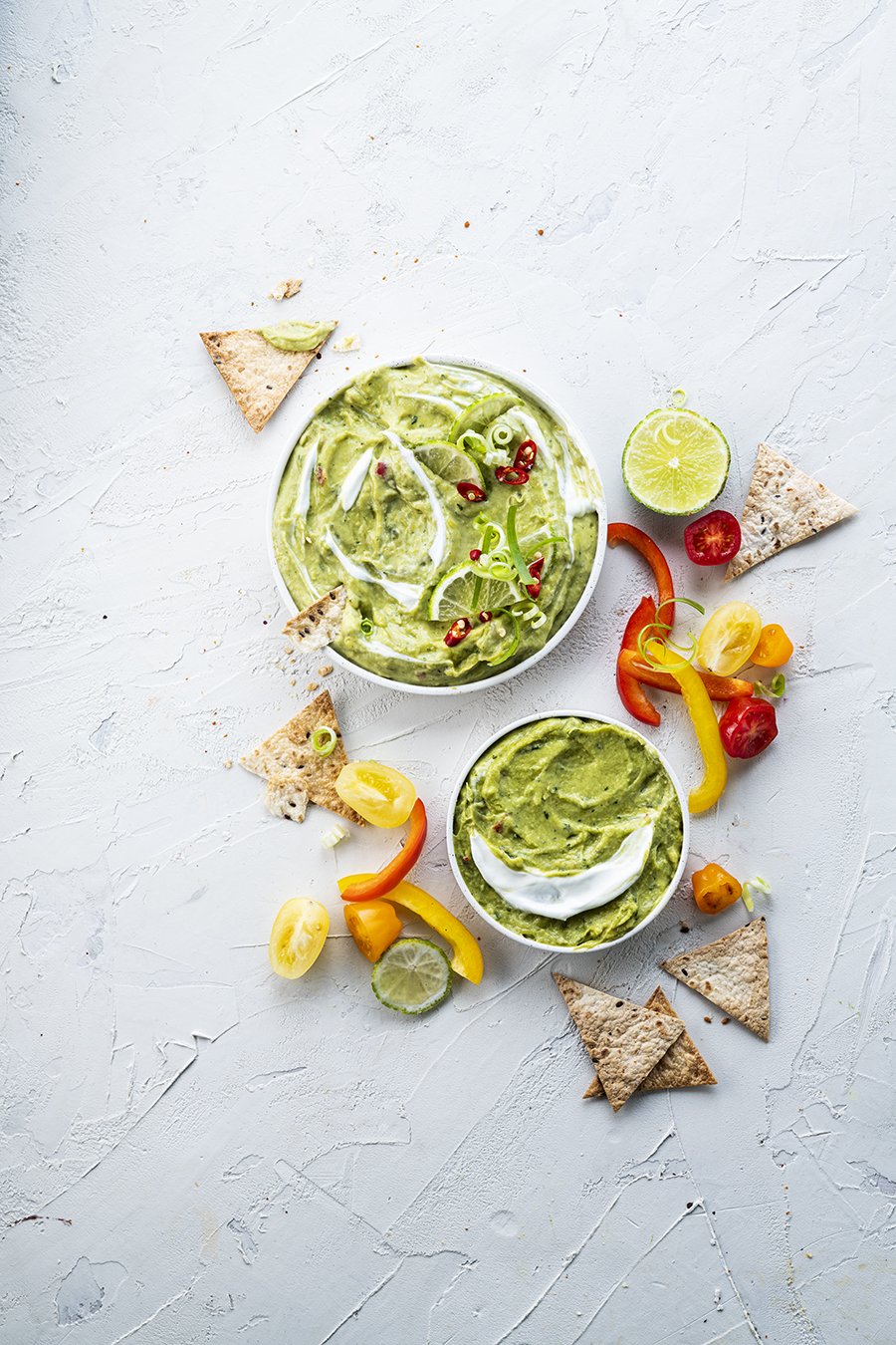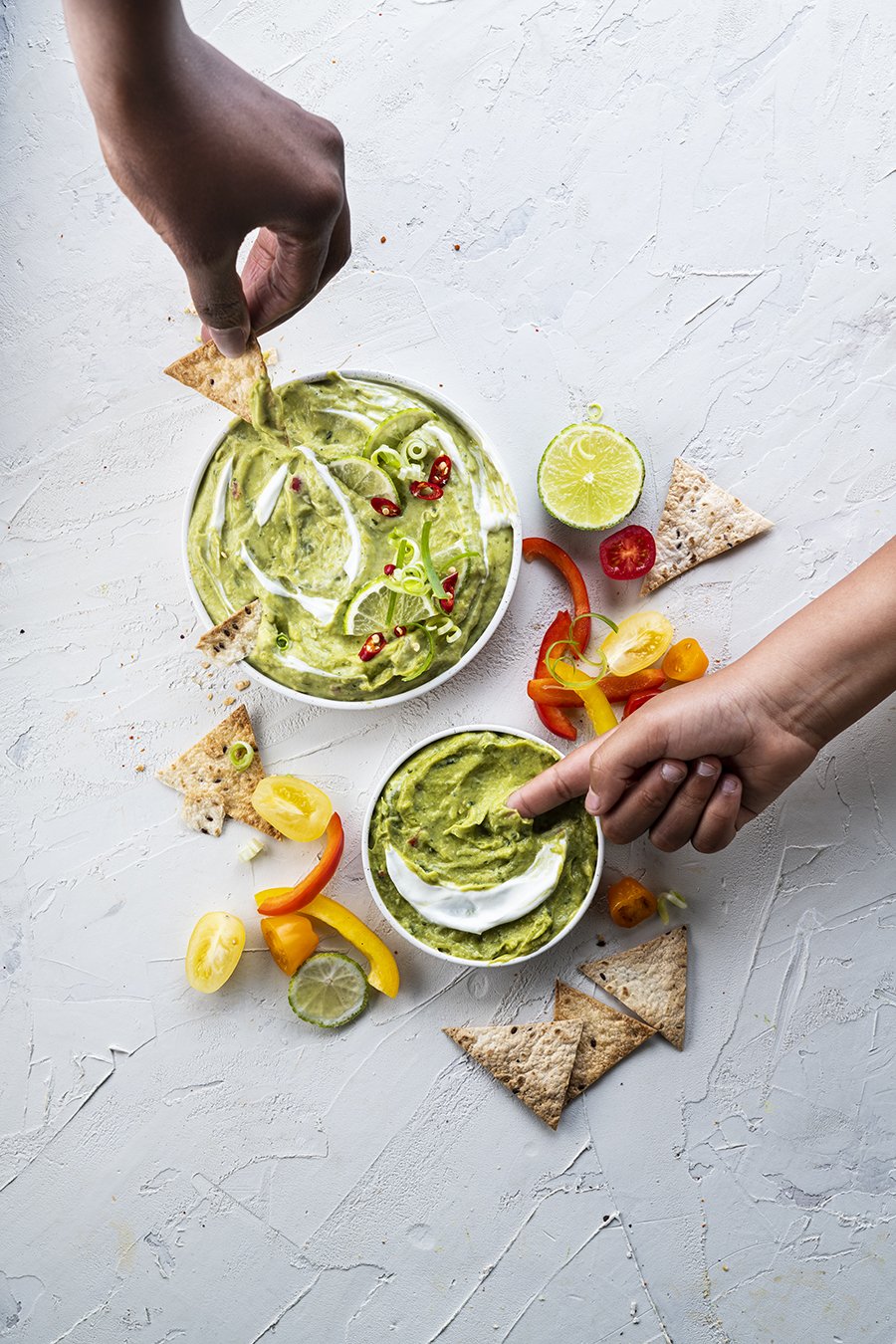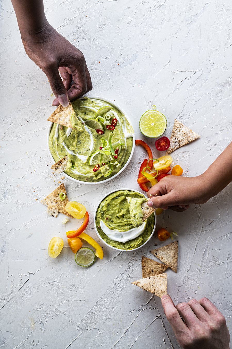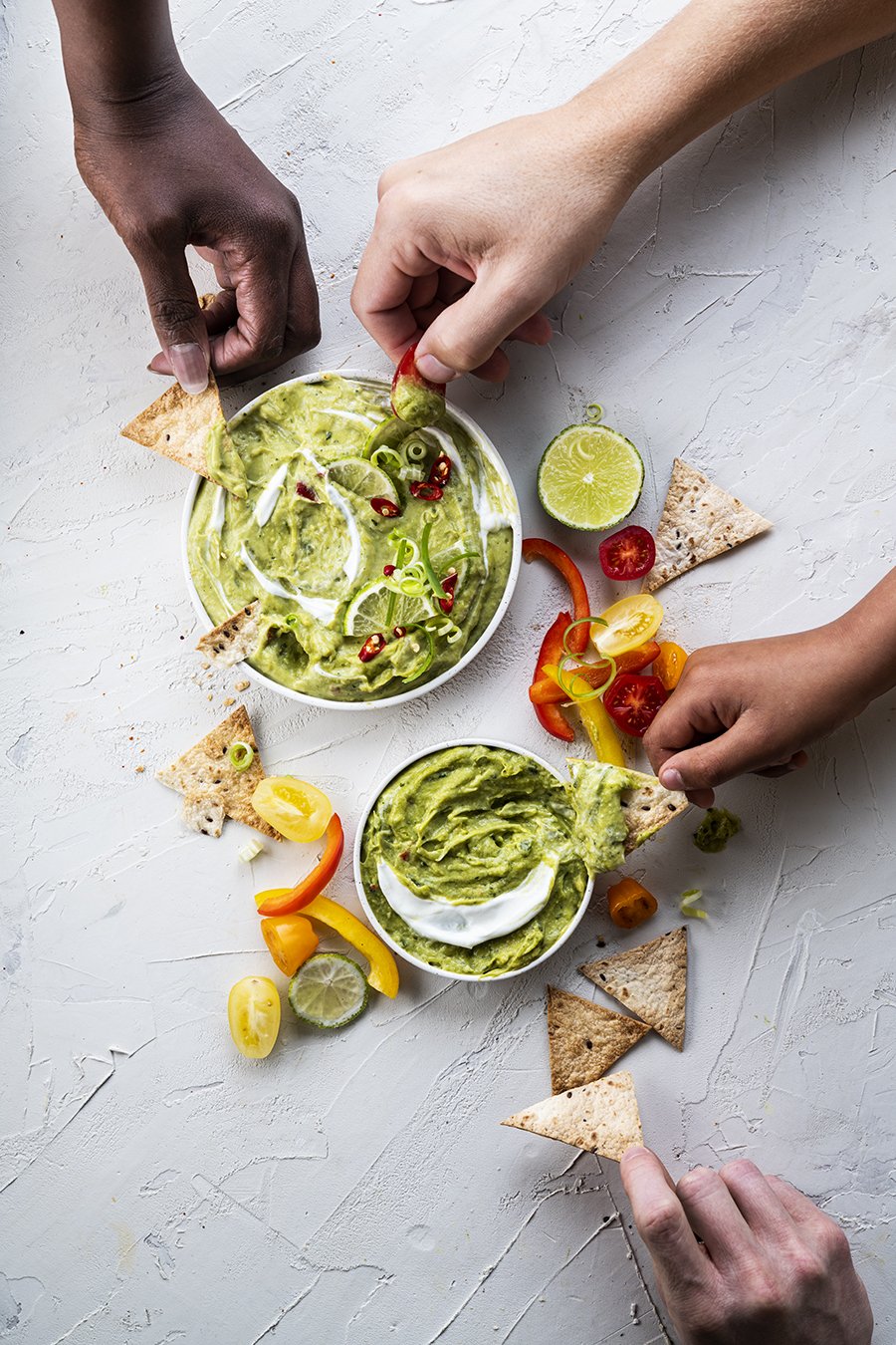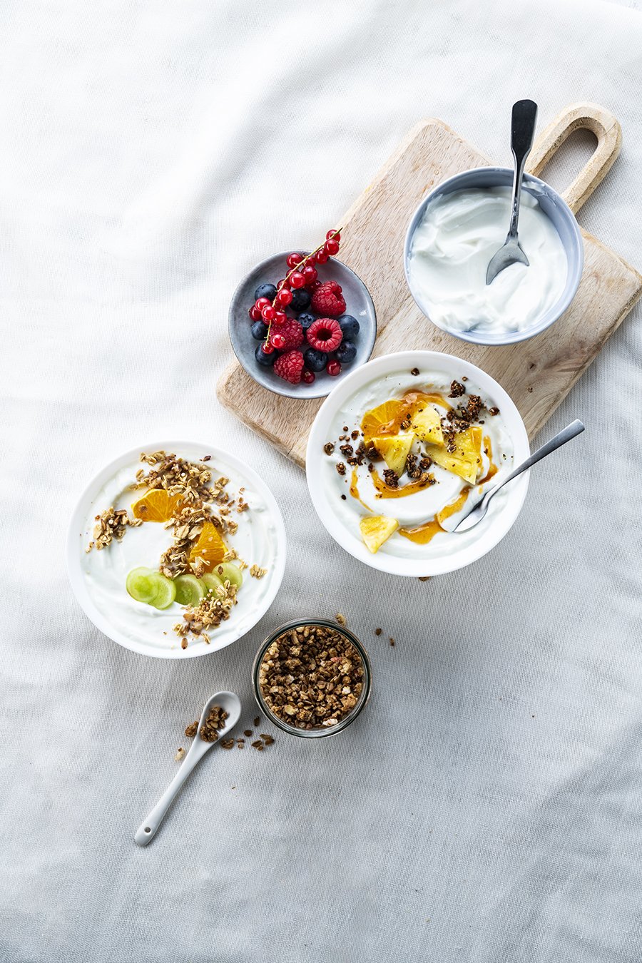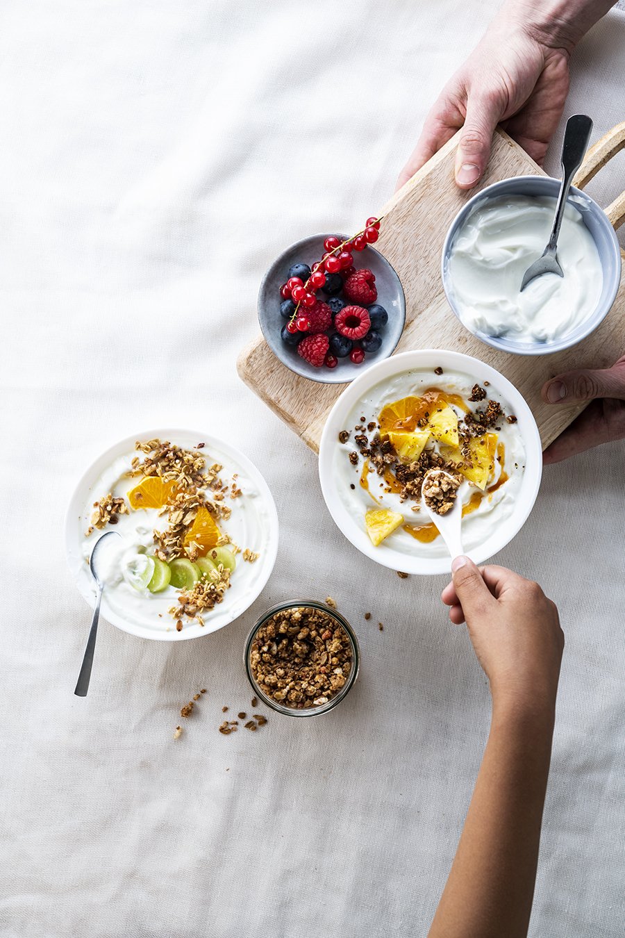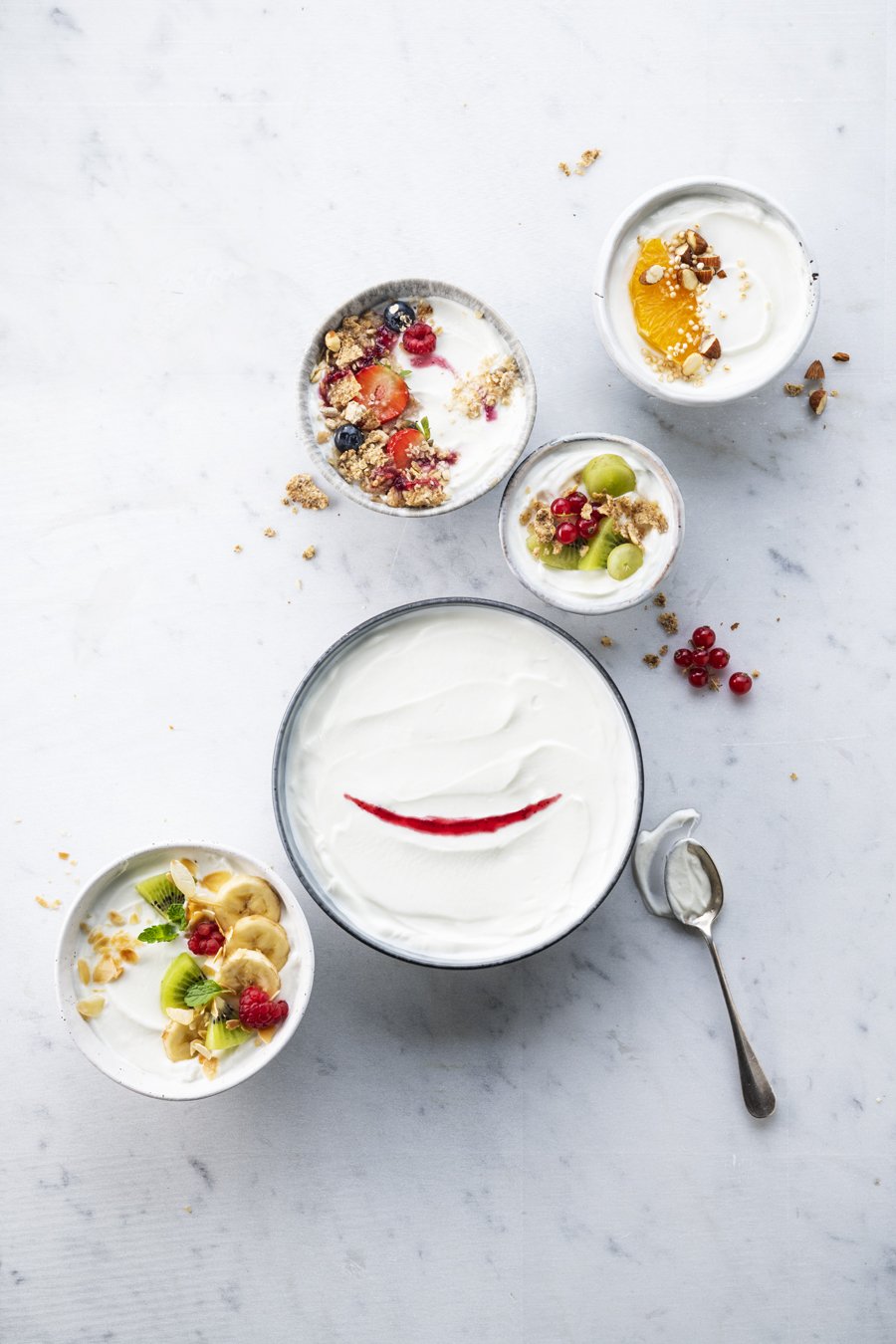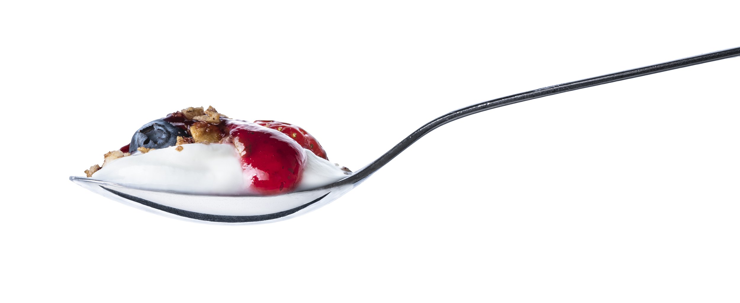
Creamy smiles rich in Calcium.
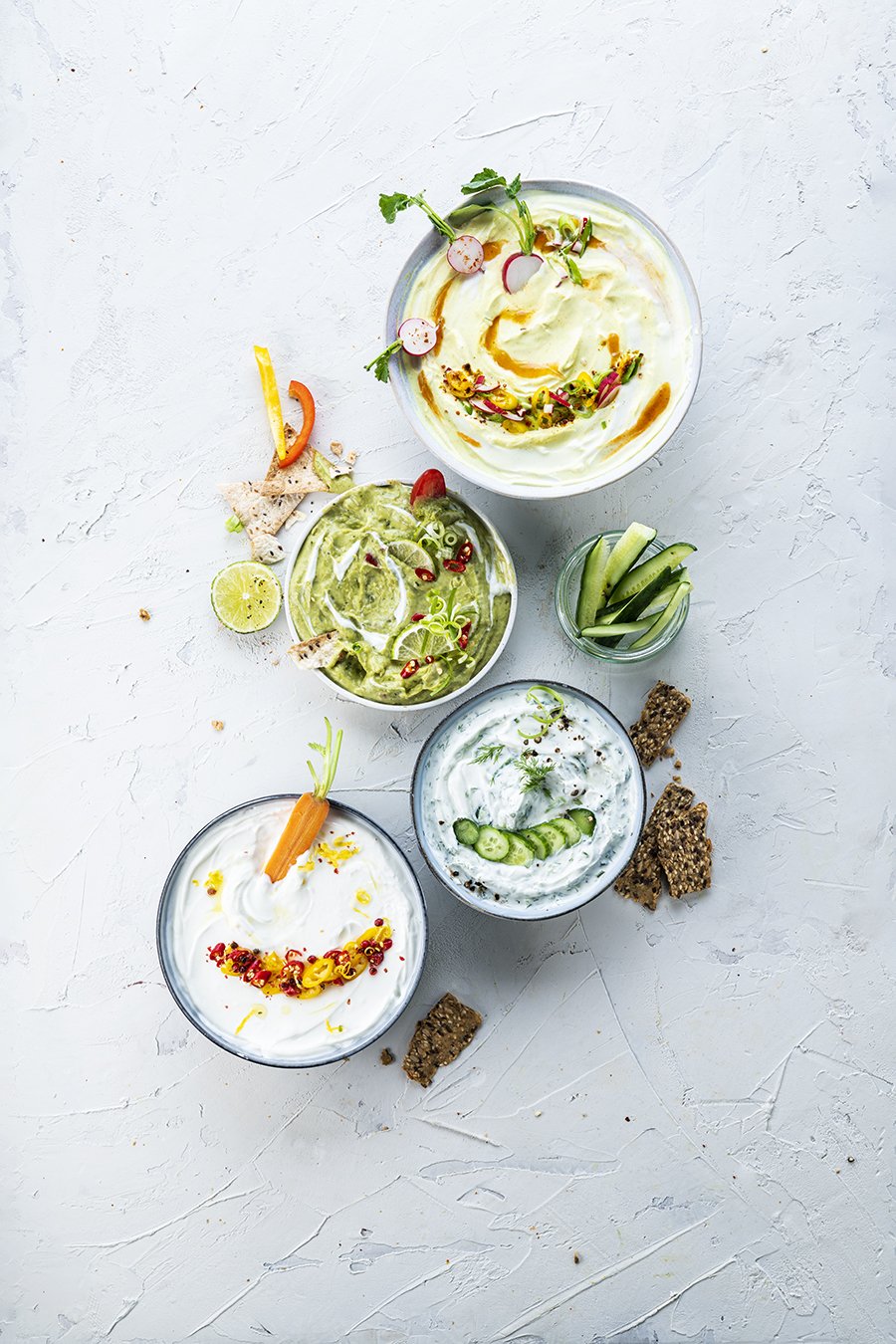
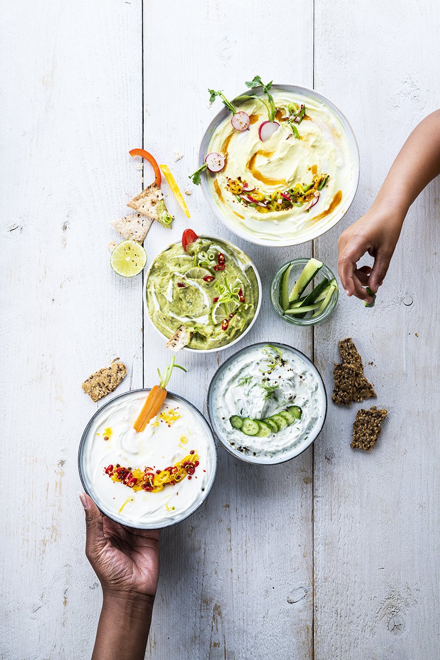
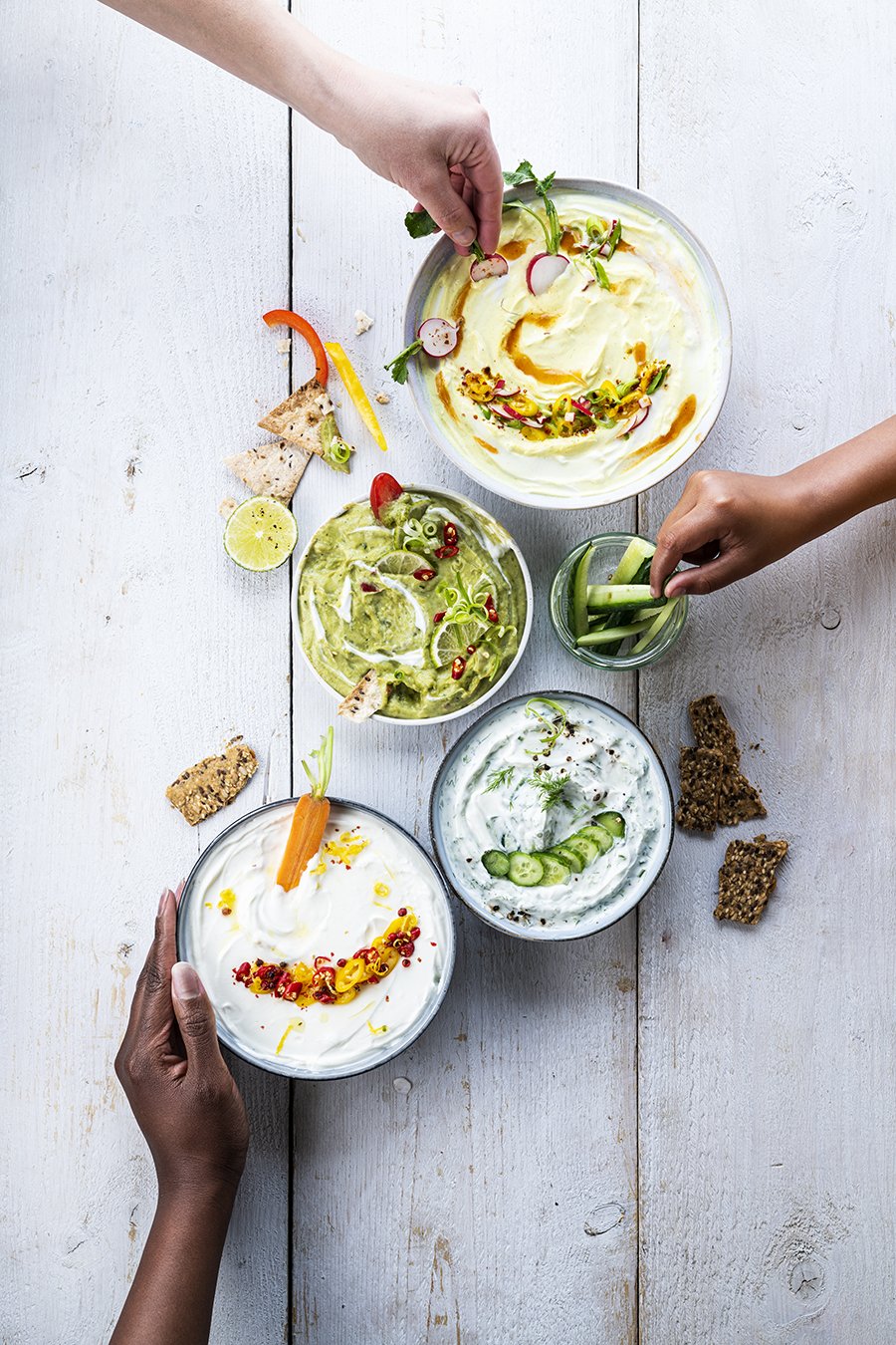
A visual system built around recognition, appetite and everyday pleasure.
Iconic cues turned into something immediate, generous and easy to want.
A flexible image framework translating brand assets into consistent visual signals.
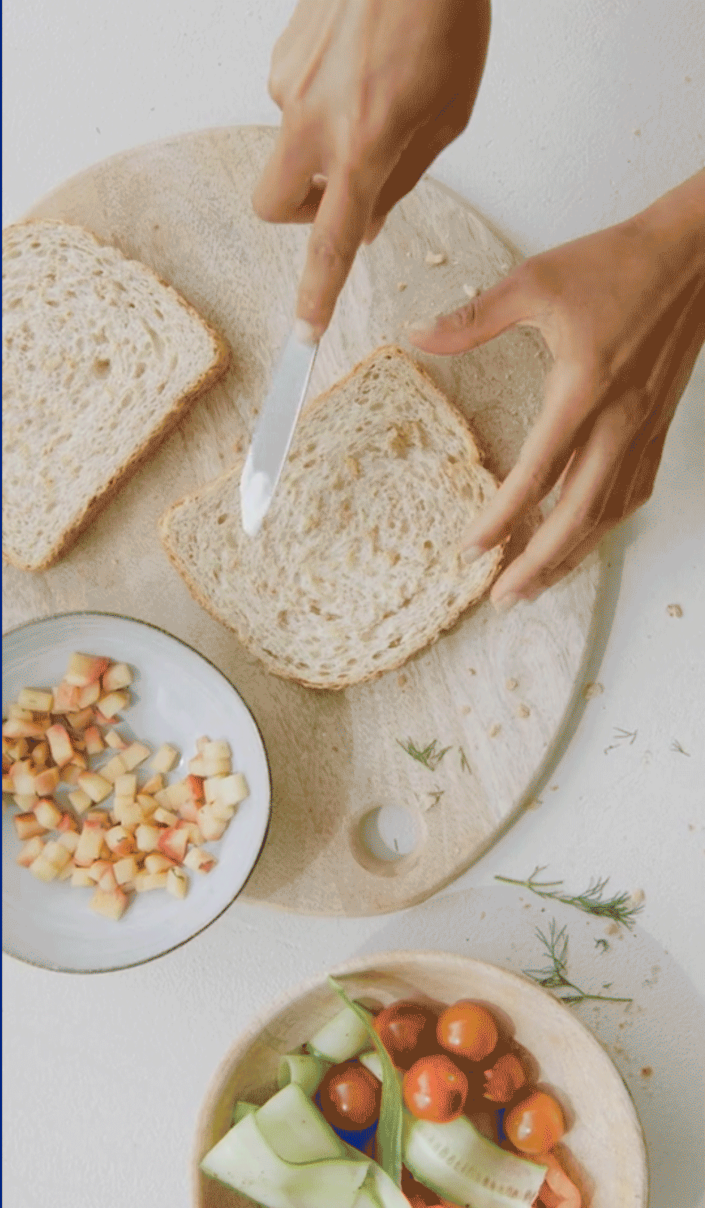
Based on texture, gesture and ingredient detail, it created a cohesive language across photography and video.
Designed to scale across campaigns and formats while reinforcing familiarity.