The power of together
For Sanyako, I defined a territory built on collective rituals — repeated moments that bind people and generate shared energy. Inspired by Japanese culture’s respect for symbols and repetition, the brand lives where groups move in sync: the same pitch, the same gig, the same sunset. The ⚡️ isn’t decoration — it’s a symbol of connection. More than well-made shoes, Sanyako charges the moments we share. Belonging here isn’t about standing out, but about being together.
My role
Concept originator and Creative / Art Director. Defined the brand territory, symbolic system and overall creative direction across touchpoints.
Problem / opportunity
How to build a contemporary, integrated footwear campaign without leaning on individual performance or ego — in a category obsessed with standing out.
Creative thinking
Shift the focus from the individual to the collective. Use ritual, repetition and shared moments as the emotional engine of the brand, turning a simple symbol into a marker of belonging and shared energy.
Outcome / impact
A clear, ownable territory rooted in culture rather than trends. A brand language flexible enough to live across platforms, formats and communities — strong enough to feel meaningful without being loud.
— Creative / Art Director
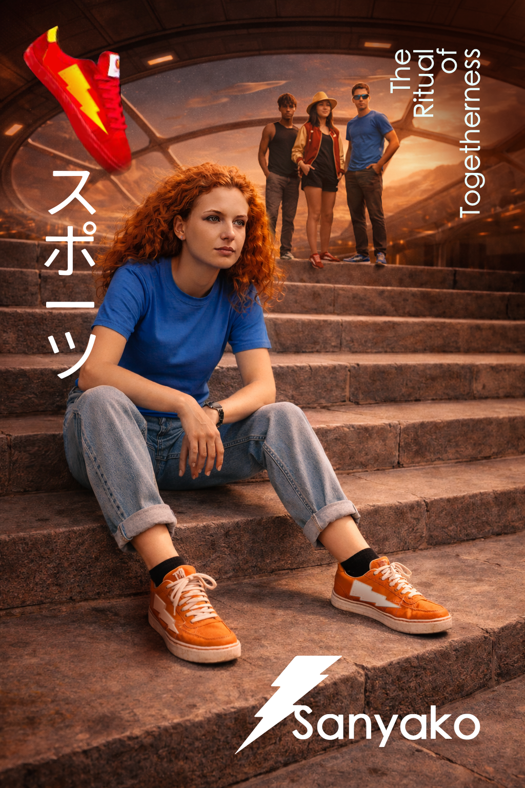
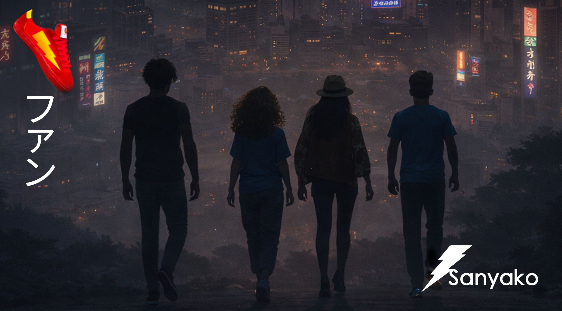
Key visuals:
Reels:
Territory:
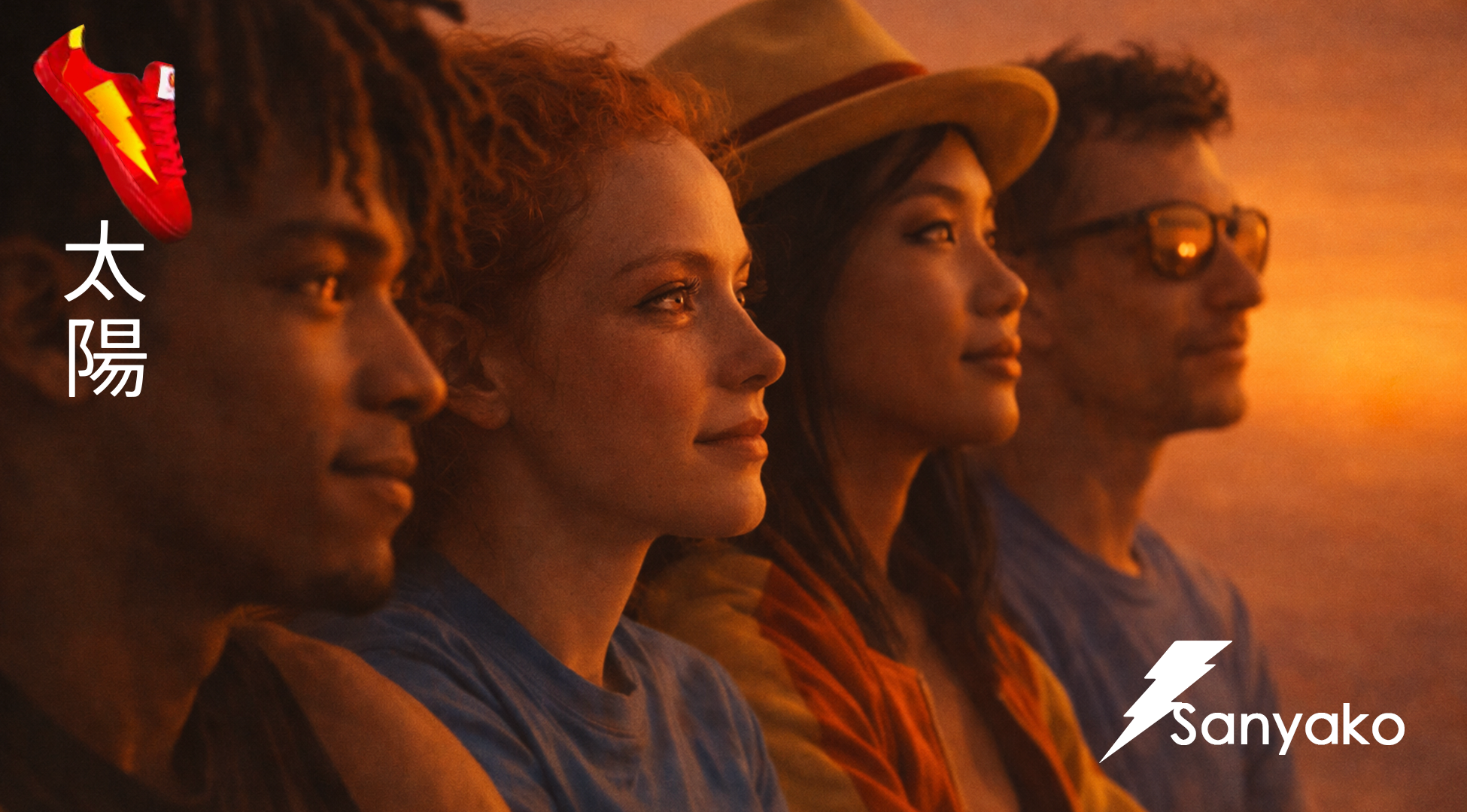
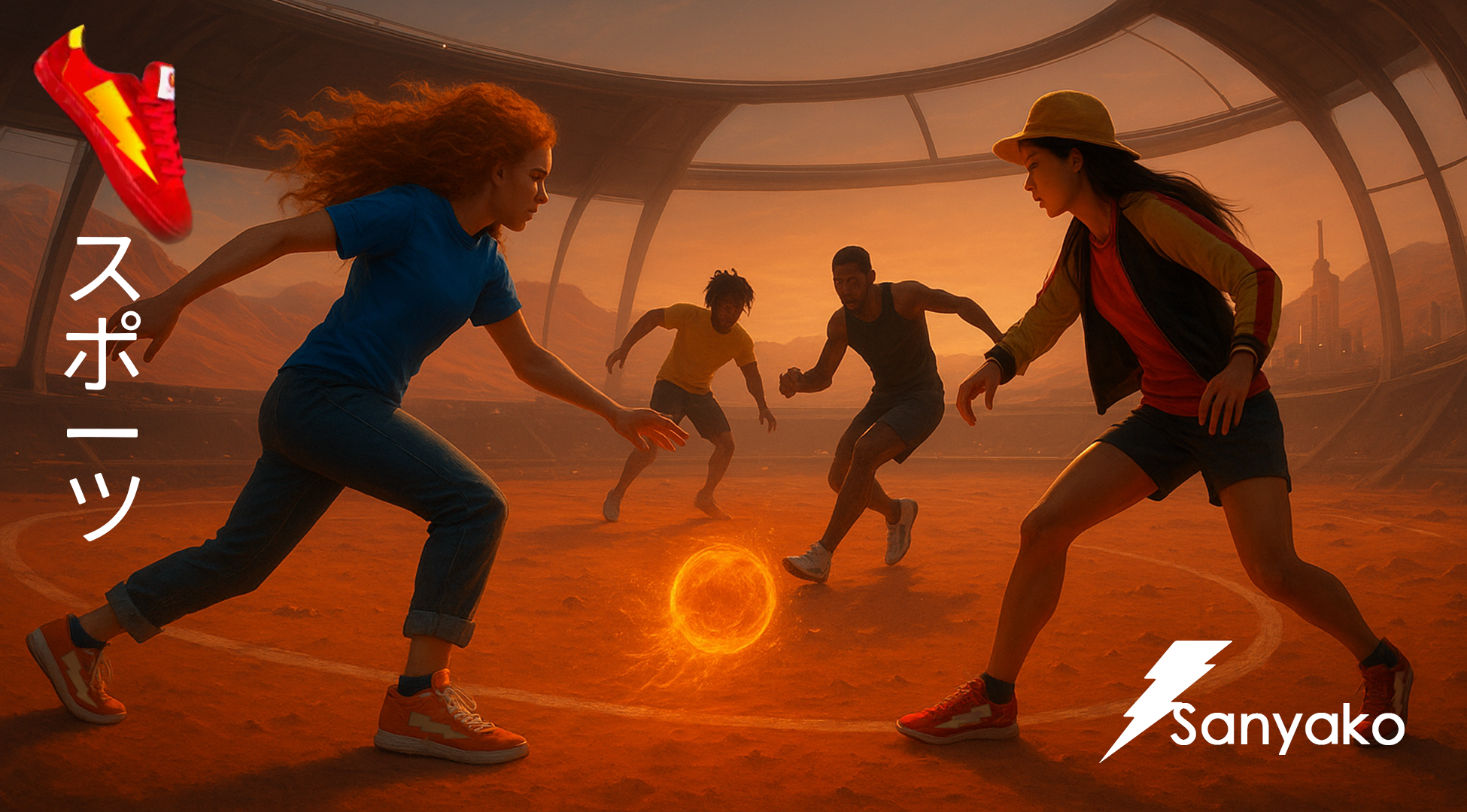
Moments that repeat, bind, and charge the group:
the same pitch, the same gig, the same sunset spot.
Sanyako lives in those rituals — as shared energy.
Japanese culture as backbone:
rituals, respect for repetition, symbols with meaning.
The ⚡️ isn’t noise — it’s connection.
Keywords:
Ritual · Collective energy · Repetition · Belonging · Calm power
Single-minded proposition:
Shoes that charge the moment you share.
They fit. They’re well made. They look good.
But what you feel is the energy between you.
Insight:
Belonging today isn’t about standing out alone.
It’s about being in sync with others.
Groups create their own rituals —
kicks after school, gigs on Fridays, sunsets without saying much.
These moments carry energy.
In Japanese culture, symbols matter:
a mark, a gesture, a repetition can hold power.
Sanyako’s ⚡️ is that symbol —
we’re here, together.
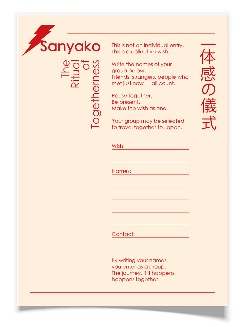
Activation:
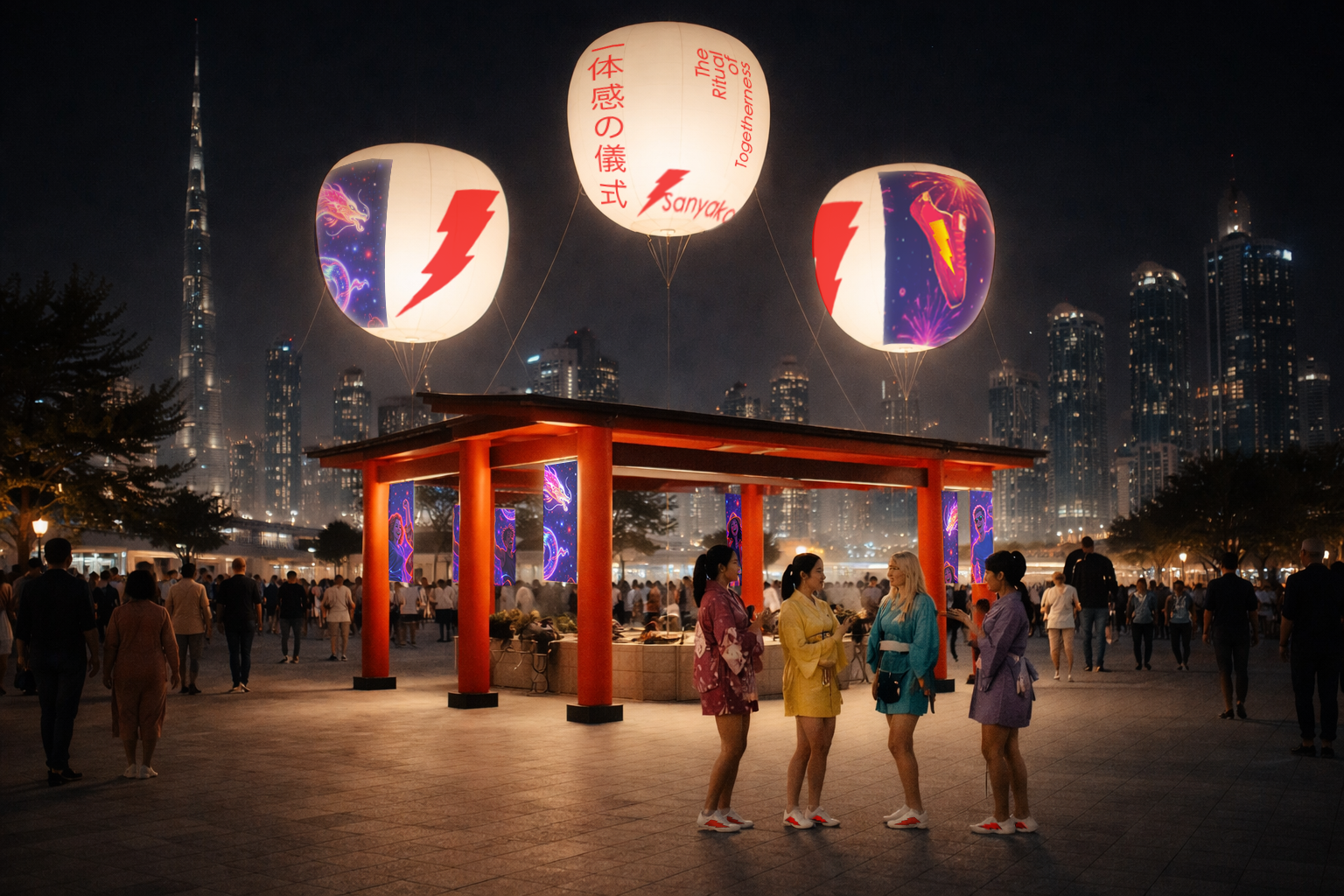
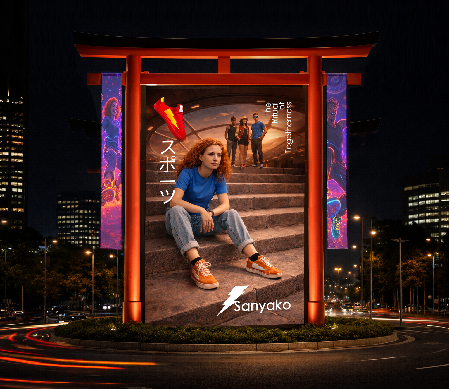
The Ritual of Togetherness
A physical ritual that turns collective energy into a chance to travel together (to Japan).
HOW IT WORKS:
A Sanyako stand designed as a ritual space, inspired by Japanese collective practices.
A place where groups pause, gather, and make a wish together.
Not individual entries.
Only groups. (The group can be created joining people who are passing by.)
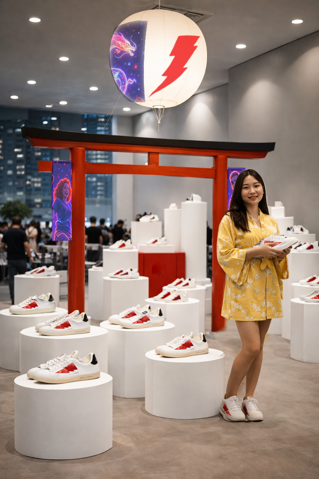
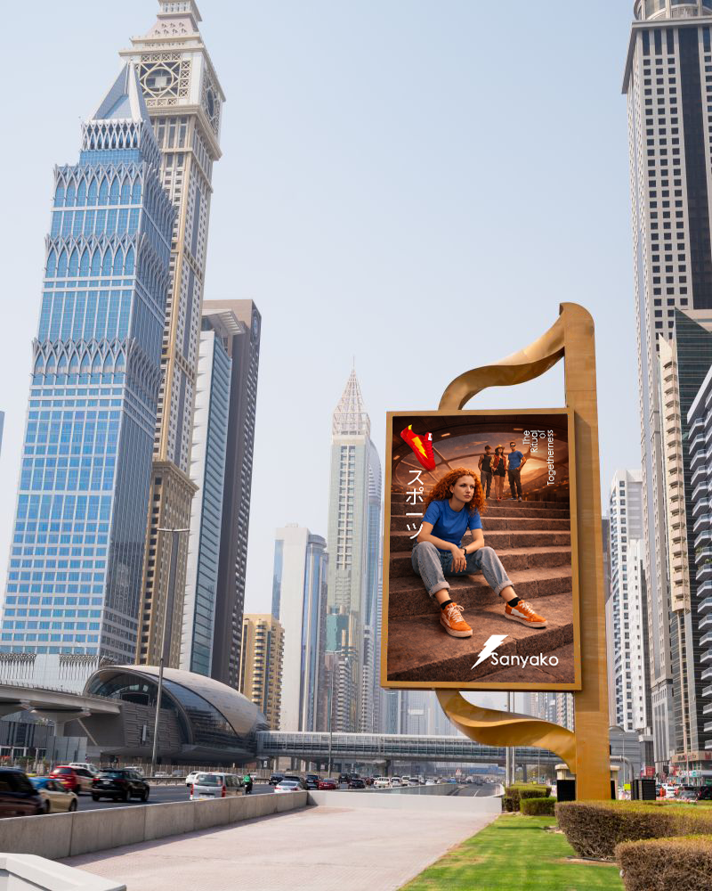
OOH (Sanyako gate / Fair):
In-store:
A ritual space
The store becomes a calm, charged environment — not decoration, but intention.
Symbols are composed to create a ritual space, where shopping becomes almost ceremonial moment.
Every element reinforces presence, repetition and japanese elements.
Launching strategy: Display one product = focus on the brand icon.
CORE PRINCIPLE:
White space + one point of energy
Inspired by the Japanese flag:
White → calm, respect, clarity
Red → energy, focus, togetherness
Reinterpreted through Sanyako:
White as the dominant space
Red as the ⚡️ moment